Redesigning a Consulting Firm as a Modern, Tech-Forward Brand
Redesigning a Consulting Firm as a Modern, Tech-Forward Brand
Industry
Management Consulting
Project Type
Web Design
Tags
Information Architecture
Branding
Responsive Web Design
Industry
Management Consulting
Role
Lead UI/UX Designer
Project Type
Web Design
Tool
Figma
Tags
Information Architecture
Branding
Responsive Web Design
Link
Context
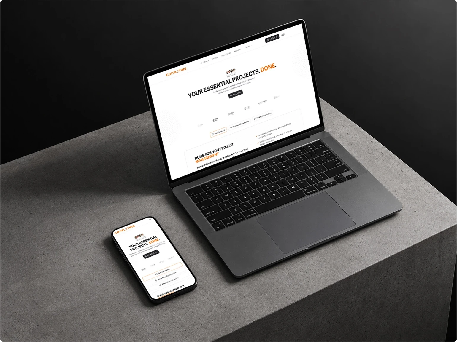
The client is a US-based consultancy helping companies complete projects through project management and workflow automation.
The business was moving toward more modern and technology-driven workflows. But their website still felt like a traditional corporate consulting site. That gap became the reason for the redesign.
I worked as the Lead UI/UX Designer, handling the research, UX direction, visual design, iteration, and design system for the redesign.
The new site eventually went live, and the client loved the direction. So much that the landing page wasn't the last time we used it. The same visual language went on to shape the rest of the website, presentations, flyers, social graphics, and other brand materials.
But before all of that happened, I had to figure out what was actually holding the old website back.
Discovery
Before exploring the redesign, I first needed to understand who the website was for, what they needed, and what mattered to them when evaluating the company.
User Persona
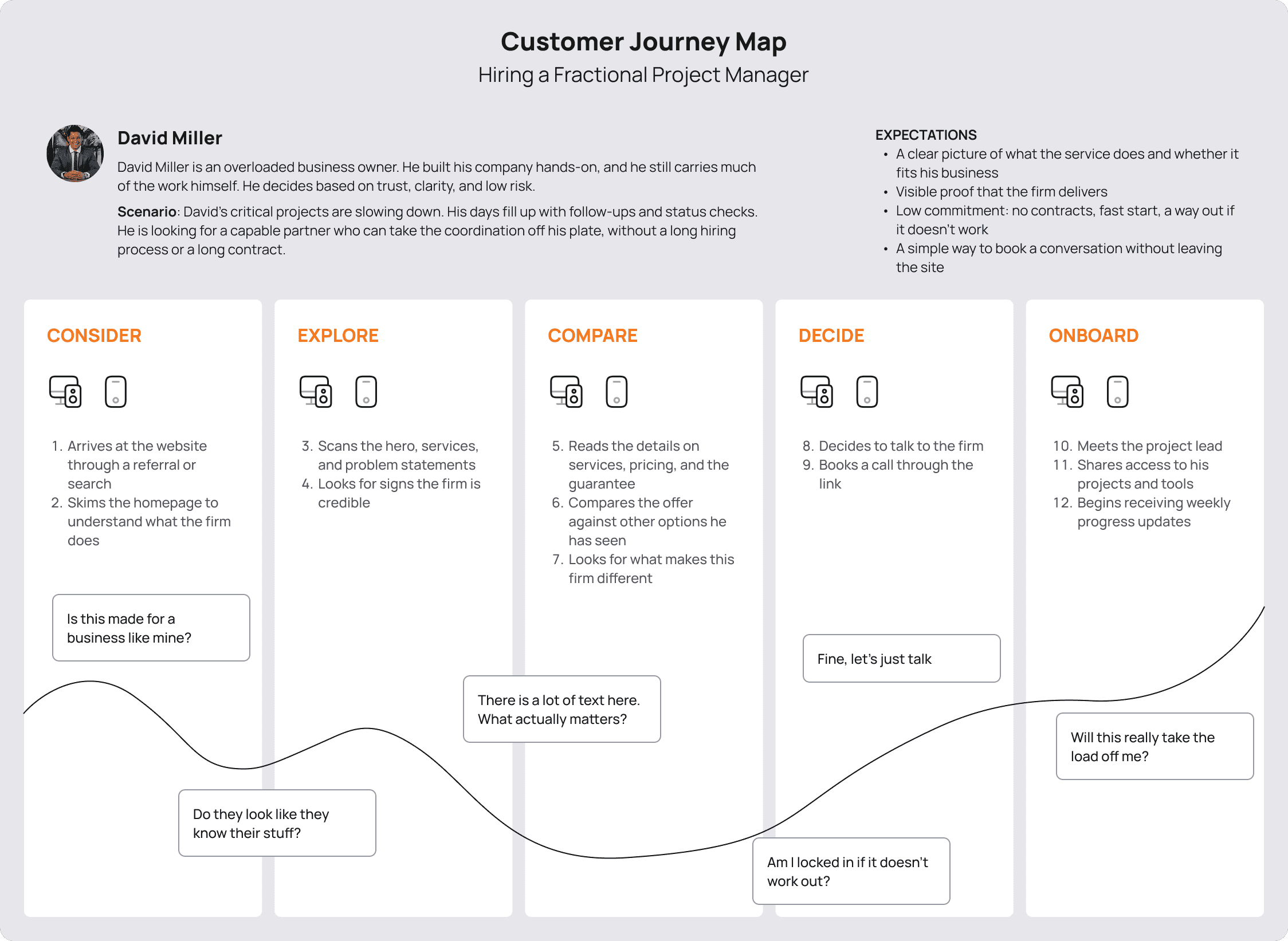
I created user personas to understand who the website was designed for, including their goals, needs, and characteristics. The audience are mostly older demographics and executives, which became an important consideration throughout the redesign.

Customer Journey
I mapped the customer journey to understand how users interact with the website, where they may encounter friction, and which moments matter most when moving toward conversion.
Reviewing the Existing Website
With a clearer picture of the users and their journey, I then looked at the existing website to understand how well it supported that experience.
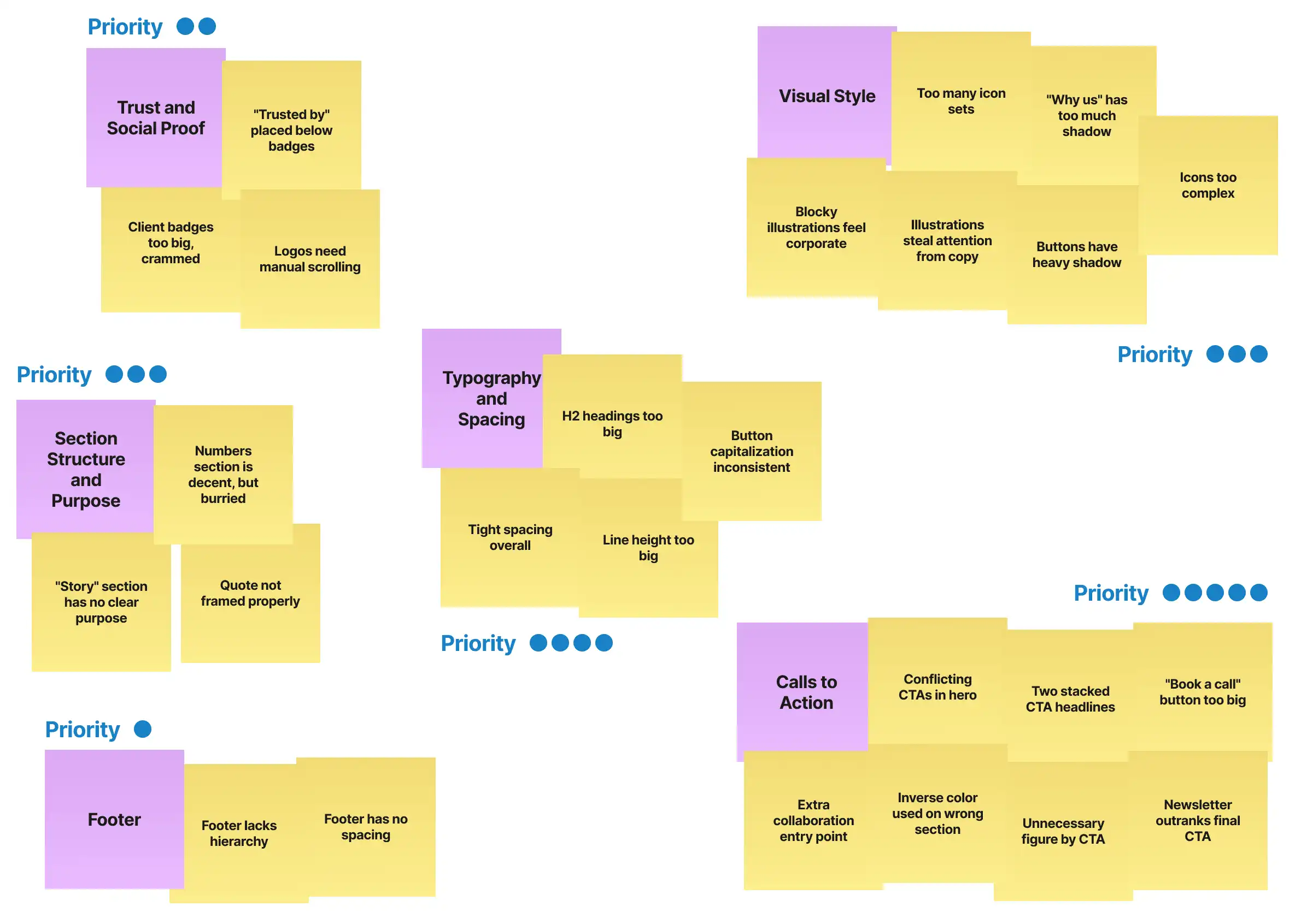
I conducted a quick UI/UX review to understand what was working and what needed to change. Since this was already a full redesign, I avoided creating a lengthy UX audit. Instead, I used an affinity diagram to group the main observations and identify the larger problems.
Stakeholder & Competitor Research
I also researched competitors and conducted informal interviews with the CEO and someone from business operations.
This helped clarify the business goal, constraints, and desired positioning before moving into visual exploration.

Problem
The research and review gave me a clearer picture of where the existing website was falling short. I grouped the findings into a few larger problems that became the focus of the redesign.
Unclear Conversion Path
The hero contained conflicting CTAs, while multiple other entry points competed for attention throughout the page.

Content Competing With Visuals
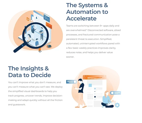
Large, blocky illustrations and oversized elements frequently pulled attention away from the copy. Complex icons, large client badges, and decorative elements added further visual competition.
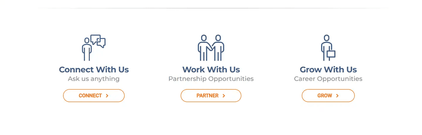
Weak Content Hierarchy and Layout
Inconsistent spacing and typography made some areas feel cramped while others had excessive line height or oversized headings, making the overall experience harder to scan.

Inconsistent Visual System
The interface used multiple icon styles, inconsistent button capitalization, heavy shadows, and different visual treatments across sections. These inconsistencies made the experience feel less cohesive and contributed to the outdated corporate feel.
Design Process
The problems gave me a clearer idea of what needed to change. I then started translating those findings into a new visual and structural direction.
Establishing the Visual Direction
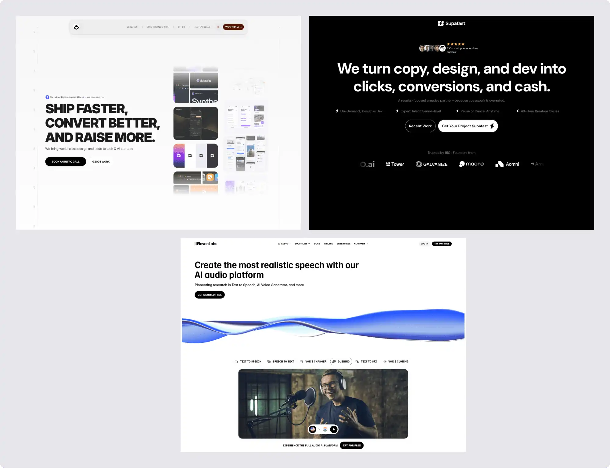
The client provided three websites as references. I used these as a starting point and expanded them into a broader moodboard.
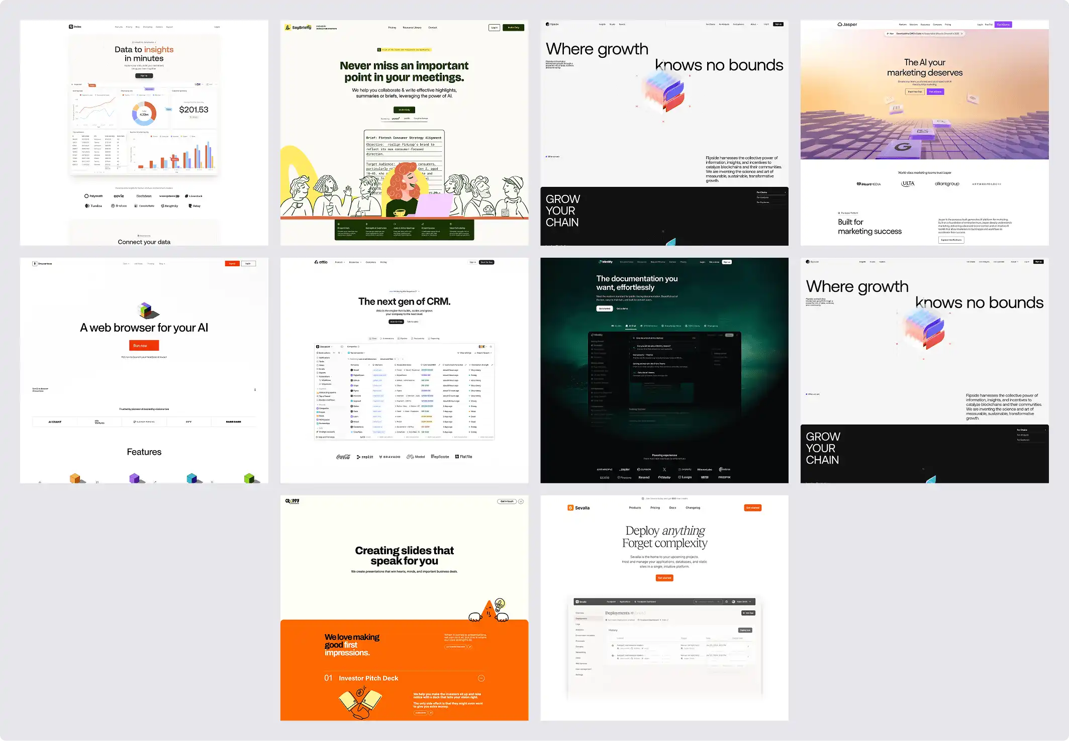
From there, I explored different combinations of typography, color, layout, imagery, and visual elements in Figma to see what could work for the brand.
Simplifying the Visual System
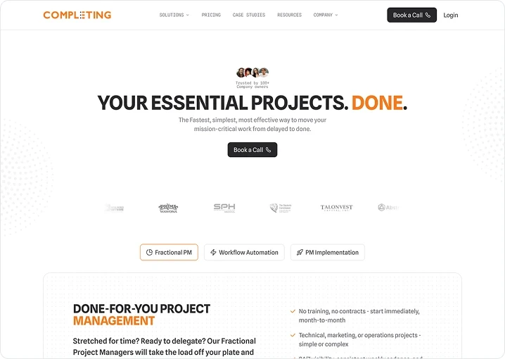
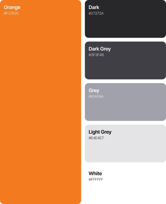
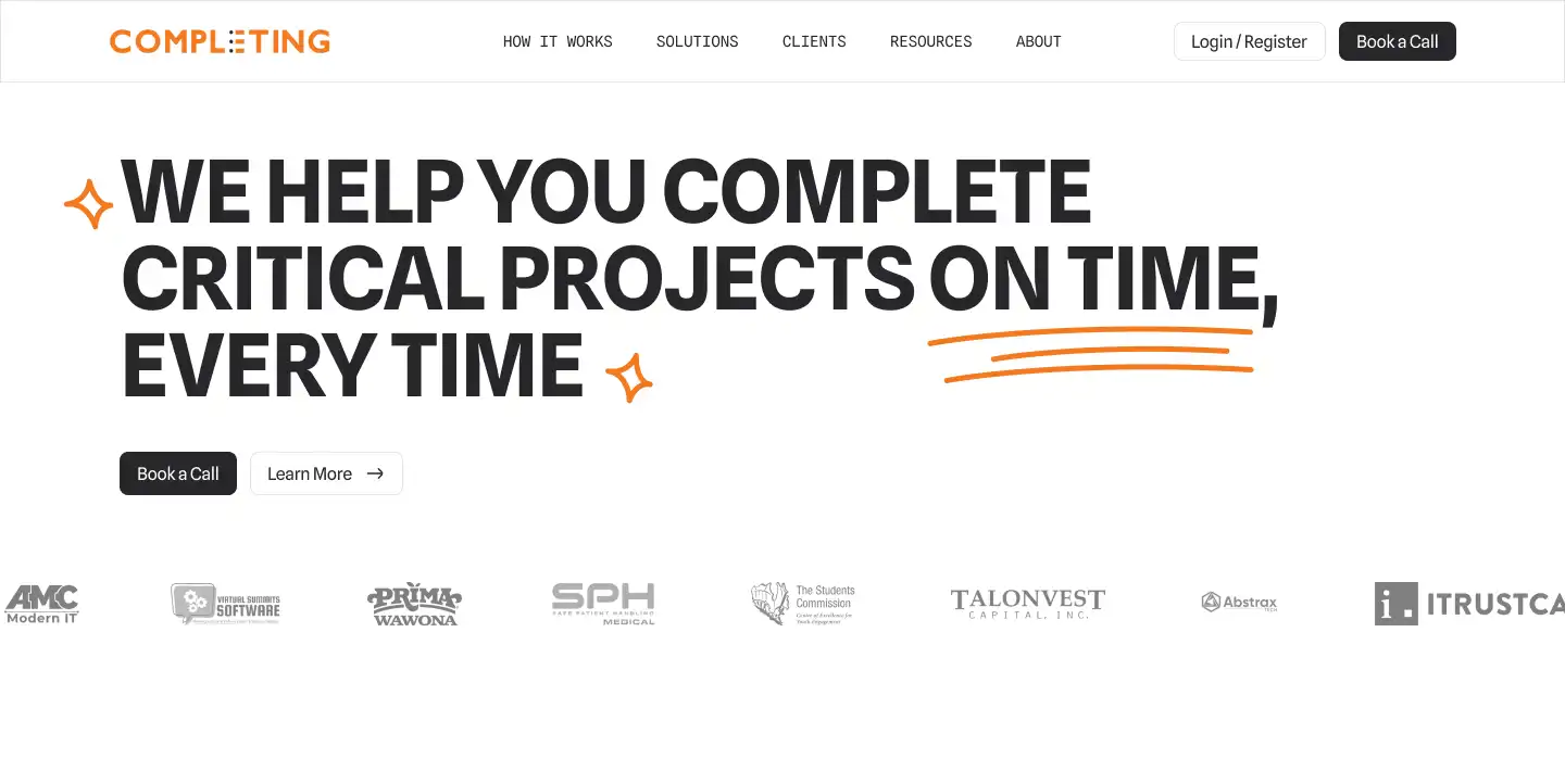
One of the first decisions was to simplify the color palette. I removed blue from the main color system and built the interface around the existing orange with grayscale tones.
For typography, I initially explored Inter, but wanted something more distinctive. The client's forward-looking positioning also led me toward mono typefaces.
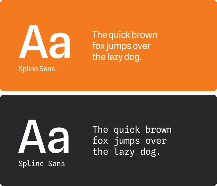
I eventually use a pairing of Spline Sans and Spline Sans Mono. They are simple but still have unique and distinct feature that gives personality to the brand.
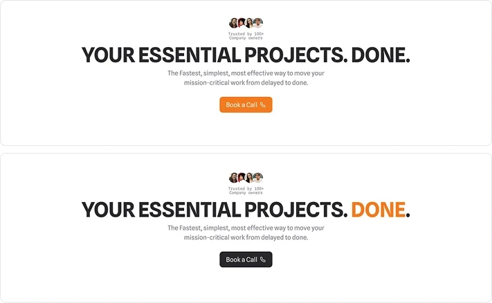
At first, I used lowercase headings, but they didn't feel commanding or authoritative enough for the direction I was aiming for. Lowercase headings feels too playful for a consulting brand.
I then switched to all-caps headings, and all of sudden the page feel more established.
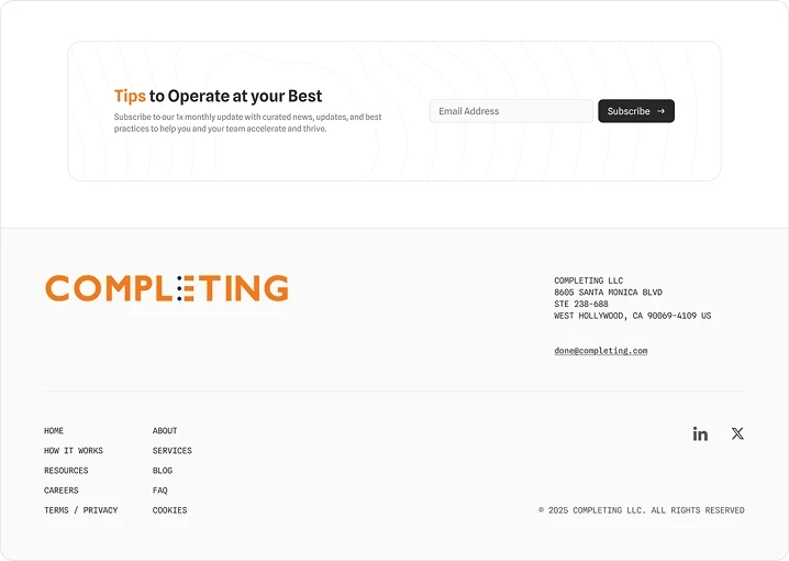
Then, to reinforce the brand, I used orange as an accent throughout the headings. It also worked as a visual highlighter, drawing attention to key words and phrases.

Improving Content Hierarchy
The amount of information was one of the biggest challenges. The CEO made it clear that we couldn't cut the content any further, so I had to find a way to make it easier to digest without removing anything.
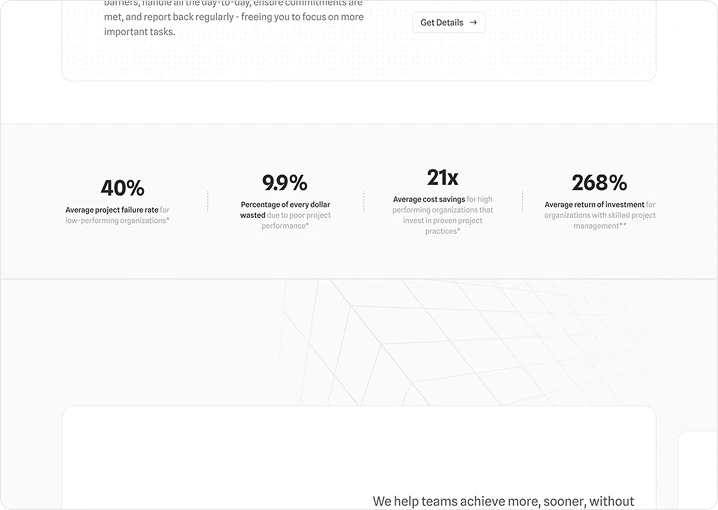
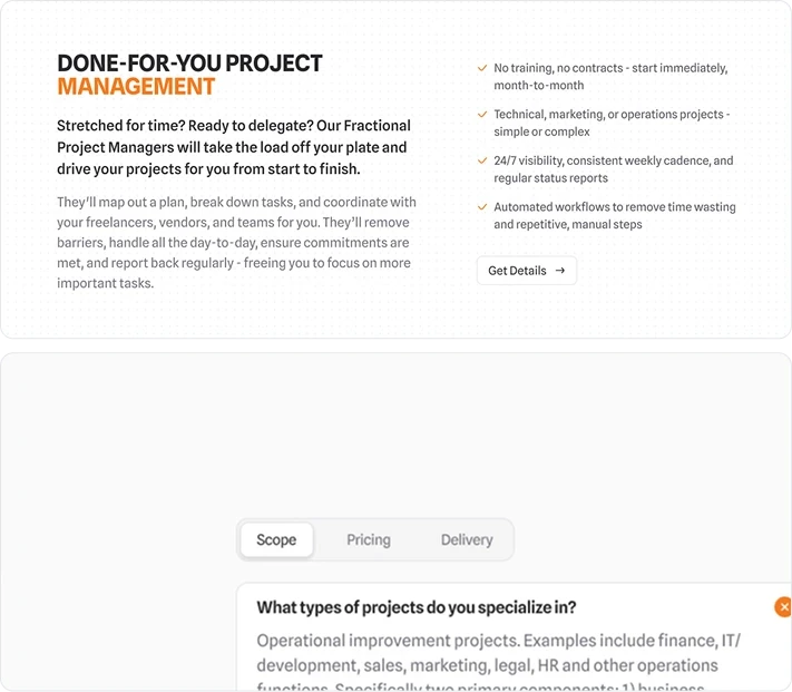
I introduced multiple levels of visual hierarchy, allowing users to quickly scan the page while still keeping the necessary information visible.
For longer sections, I used progressive disclosure to avoid overwhelming users with too much information at first glance.
For the primary button, I chose dark instead of orange. Orange made the high-ticket consulting service feel too playful, while dark buttons gave the interface a more established and trustworthy feel.
Bright orange also felt visually harsh when used as a primary button, especially against the rest of the interface.
Exploring, Testing, and Cutting
Several ideas were explored but ultimately removed.
My first hero concept was... not great. It was playful, loud, and completely wrong for the brand.
I also explored dark mode, but we decided against it because of accessibility concerns and the additional implementation time.

The client gave me a few existing resources to work with. I tried bringing some of those elements into the new design, but they quickly added too much visual noise. The blocky shapes and heavy use of blue also didn't fit the new visual direction, so I left them behind.

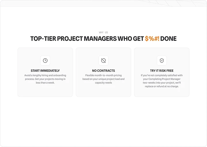
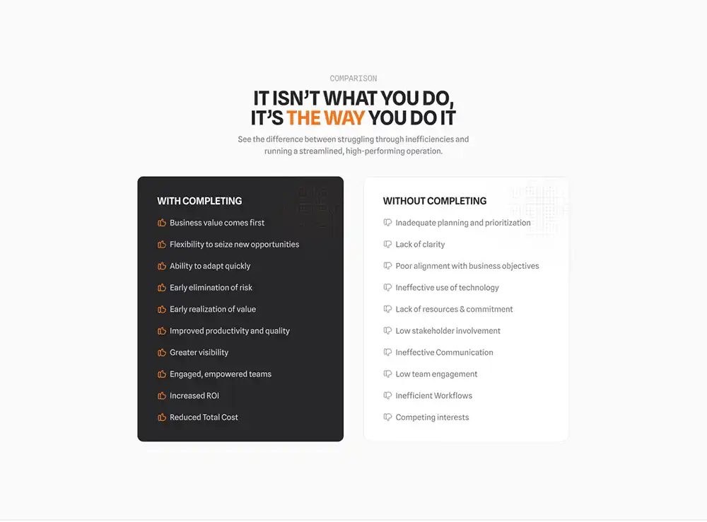
A comparison section inspired by competitor research was also explored, but it felt unnecessary because the website already had a similar "Why Us" section.
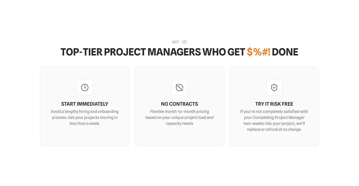
For some sections, I briefly explored a more illustrative icon style before the CEO pushed the design back toward minimalism. He reminded me that minimalism was one of the core philosophies of the brand.
So I went back to Lucide icons instead. They were simple, fit the brand better, and created more consistency since I was already using them as the primary icon set throughout the page.

Finding the Right Amount of Personality
The earliest version had almost no decoration. It looked premium and modern, but it also felt a little too sterile and perhaps empty.
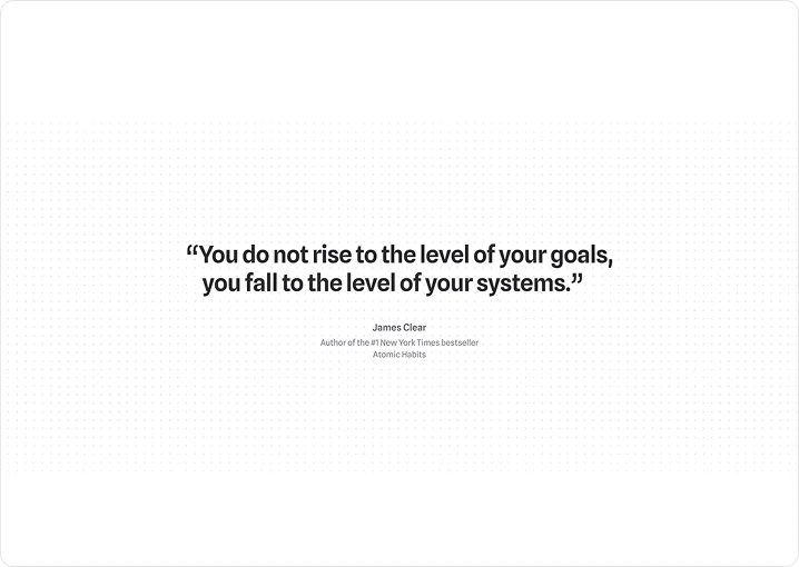
After exploring dozens of decoration concepts, I landed on a simple dot motif.
The idea actually came from two places. First, the CEO already used dots in his copy. Second, there was a similar dot element hiding in the logo. So rather than inventing another decorative element, I had something that was already part of the brand.
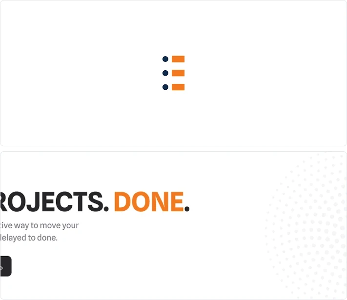
The dots brought some warmth back into the design without bringing back the clutter. More importantly, it gave the new visual system a distinctive element that was already rooted in the brand.

Improving the Conversion Path
The existing website mainly relied on a CTA section.
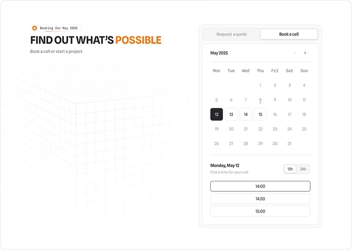
Based on competitor research, I explored adding a calendar directly into the website so potential clients could schedule a conversation without leaving the experience.

Designing for Mobile
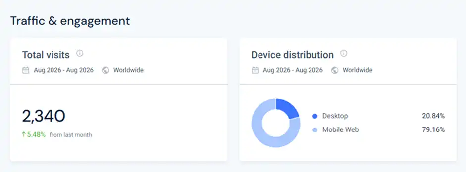
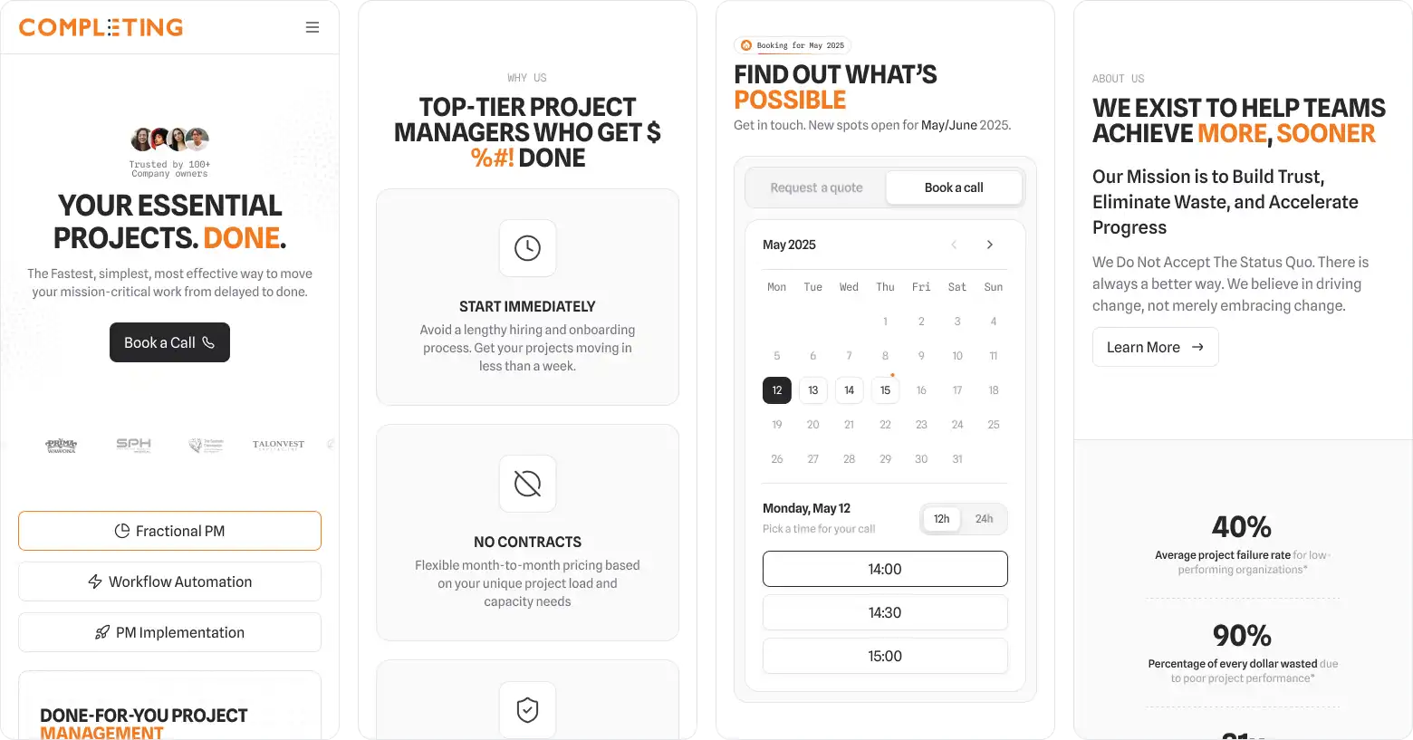
Mobile was a major consideration throughout the redesign. Public web traffic data showed that around 75% of the website's visitors were accessing it from mobile devices, making the mobile experience especially important.
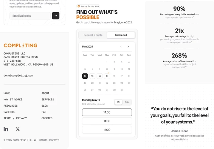
I adapted the layout, typography, spacing, navigation, and content hierarchy to work naturally on smaller screens while keeping the same visual direction and conversion path as the desktop experience.
Result
The final direction gave the website a completely different feel. It moved away from the dated, corporate look and became more focused, confident, and distinctive, while still feeling true to the brand.
Seeing the client approve it without major revisions and take it into production was genuinely rewarding.
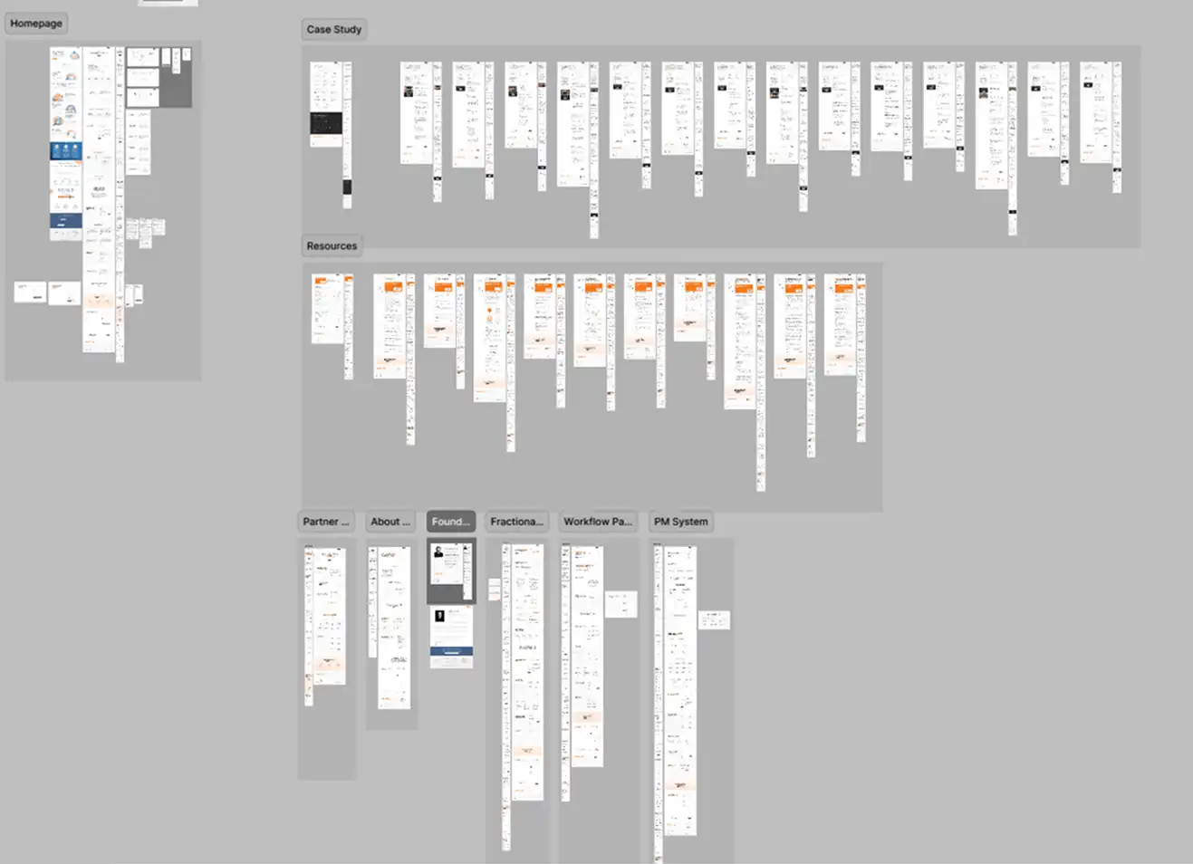
The project later grew into a full website rebuild, with case studies, resources, partner and founder pages, and solutions pages, plus social graphics, flyers, business cards, and a presentation deck.
Client Response
The business operations stakeholder shared:
"You are so talented and creative and capture our brand so well. So glad to be connected, thankyou for the amazing work you do."
Reflection
Looking back, I'm proud of where the redesign ended up, but the process also showed me where I could have done better.
What I Would Do Differently
The biggest gap was usability testing. Nobody tested the website with real users, and I didn't even do a casual walkthrough with the client's team. I relied on my own judgment and weekly CEO feedback, both from people already close to the project.
The design was good enough to get approved and shipped, but I still wonder what I would have found by putting it in front of real users earlier.
Conclusion
This project reminded me that good design isn't just about coming up with more ideas or making something look more polished. Some of the hardest decisions were actually about what to remove, what to simplify, and what to leave alone.
Context
The client is a US-based consultancy helping companies complete projects through project management and workflow automation.
The business was moving toward more modern and technology-driven workflows. But their website still felt like a traditional corporate consulting site. That gap became the reason for the redesign.
I worked as the Lead UI/UX Designer, handling the research, UX direction, visual design, iteration, and design system for the redesign.
The new site eventually went live, and the client loved the direction. So much that the landing page wasn't the last time we used it. The same visual language went on to shape the rest of the website, presentations, flyers, social graphics, and other brand materials.
But before all of that happened, I had to figure out what was actually holding the old website back.
Discovery
Before exploring the redesign, I first needed to understand who the website was for, what they needed, and what mattered to them when evaluating the company.
User Persona
I created user personas to understand who the website was designed for, including their goals, needs, and characteristics. The audience are mostly older demographics and executives, which became an important consideration throughout the redesign.
Customer Journey
I mapped the customer journey to understand how users interact with the website, where they may encounter friction, and which moments matter most when moving toward conversion.
Reviewing the Existing Website
With a clearer picture of the users and their journey, I then looked at the existing website to understand how well it supported that experience.
I conducted a quick UI/UX review to understand what was working and what needed to change. Since this was already a full redesign, I avoided creating a lengthy UX audit. Instead, I used an affinity diagram to group the main observations and identify the larger problems.
Stakeholder & Competitor Research
I also researched competitors and conducted informal interviews with the CEO and someone from business operations.
This helped clarify the business goal, constraints, and desired positioning before moving into visual exploration.
Problem
The research and review gave me a clearer picture of where the existing website was falling short. I grouped the findings into a few larger problems that became the focus of the redesign.
Unclear Conversion Path
The hero contained conflicting CTAs, while multiple other entry points competed for attention throughout the page.
Content Competing With Visuals
Large, blocky illustrations and oversized elements frequently pulled attention away from the copy. Complex icons, large client badges, and decorative elements added further visual competition.
Weak Content Hierarchy and Layout
Inconsistent spacing and typography made some areas feel cramped while others had excessive line height or oversized headings, making the overall experience harder to scan.
Inconsistent Visual System
The interface used multiple icon styles, inconsistent button capitalization, heavy shadows, and different visual treatments across sections. These inconsistencies made the experience feel less cohesive and contributed to the outdated corporate feel.
Design Process
The problems gave me a clearer idea of what needed to change. I then started translating those findings into a new visual and structural direction.
Establishing the Visual Direction
The client provided three websites as references. I used these as a starting point and expanded them into a broader moodboard.
From there, I explored different combinations of typography, color, layout, imagery, and visual elements in Figma to see what could work for the brand.
Simplifying the Visual System
One of the first decisions was to simplify the color palette. I removed blue from the main color system and built the interface around the existing orange with grayscale tones.
For typography, I initially explored Inter, but wanted something more distinctive. The client's forward-looking positioning also led me toward mono typefaces.
I eventually use a pairing of Spline Sans and Spline Sans Mono. They are simple but still have unique and distinct feature that gives personality to the brand.
At first, I used lowercase headings, but they didn't feel commanding or authoritative enough for the direction I was aiming for. Lowercase headings feels too playful for a consulting brand.
I then switched to all-caps headings, and all of sudden the page feel more established.
Then, to reinforce the brand, I used orange as an accent throughout the headings. It also worked as a visual highlighter, drawing attention to key words and phrases.
Improving Content Hierarchy
The amount of information was one of the biggest challenges. The CEO made it clear that we couldn't cut the content any further, so I had to find a way to make it easier to digest without removing anything.
I introduced multiple levels of visual hierarchy, allowing users to quickly scan the page while still keeping the necessary information visible.
For longer sections, I used progressive disclosure to avoid overwhelming users with too much information at first glance.
For the primary button, I chose dark instead of orange. Orange made the high-ticket consulting service feel too playful, while dark buttons gave the interface a more established and trustworthy feel.
Bright orange also felt visually harsh when used as a primary button, especially against the rest of the interface.
Exploring, Testing, and Cutting
Several ideas were explored but ultimately removed.
My first hero concept was... not great. It was playful, loud, and completely wrong for the brand.
I also explored dark mode, but we decided against it because of accessibility concerns and the additional implementation time.
The client gave me a few existing resources to work with. I tried bringing some of those elements into the new design, but they quickly added too much visual noise. The blocky shapes and heavy use of blue also didn't fit the new visual direction, so I left them behind.
A comparison section inspired by competitor research was also explored, but it felt unnecessary because the website already had a similar "Why Us" section.
For some sections, I briefly explored a more illustrative icon style before the CEO pushed the design back toward minimalism. He reminded me that minimalism was one of the core philosophies of the brand.
So I went back to Lucide icons instead. They were simple, fit the brand better, and created more consistency since I was already using them as the primary icon set throughout the page.
Finding the Right Amount of Personality
The earliest version had almost no decoration. It looked premium and modern, but it also felt a little too sterile and perhaps empty.
After exploring dozens of decoration concepts, I landed on a simple dot motif.
The idea actually came from two places. First, the CEO already used dots in his copy. Second, there was a similar dot element hiding in the logo. So rather than inventing another decorative element, I had something that was already part of the brand.
The dots brought some warmth back into the design without bringing back the clutter. More importantly, it gave the new visual system a distinctive element that was already rooted in the brand.
Improving the Conversion Path
The existing website mainly relied on a CTA section.
Based on competitor research, I explored adding a calendar directly into the website so potential clients could schedule a conversation without leaving the experience.
Designing for Mobile
Mobile was a major consideration throughout the redesign. Public web traffic data showed that around 75% of the website's visitors were accessing it from mobile devices, making the mobile experience especially important.
I adapted the layout, typography, spacing, navigation, and content hierarchy to work naturally on smaller screens while keeping the same visual direction and conversion path as the desktop experience.
Result
The final direction gave the website a completely different feel. It moved away from the dated, corporate look and became more focused, confident, and distinctive, while still feeling true to the brand.
Seeing the client approve it without major revisions and take it into production was genuinely rewarding.
The project later grew into a full website rebuild, with case studies, resources, partner and founder pages, and solutions pages, plus social graphics, flyers, business cards, and a presentation deck.
Client Response
The business operations stakeholder shared:
"You are so talented and creative and capture our brand so well. So glad to be connected, thankyou for the amazing work you do."
Reflection
Looking back, I'm proud of where the redesign ended up, but the process also showed me where I could have done better.
What I Would Do Differently
The biggest gap was usability testing. Nobody tested the website with real users, and I didn't even do a casual walkthrough with the client's team. I relied on my own judgment and weekly CEO feedback, both from people already close to the project.
The design was good enough to get approved and shipped, but I still wonder what I would have found by putting it in front of real users earlier.
Conclusion
This project reminded me that good design isn't just about coming up with more ideas or making something look more polished. Some of the hardest decisions were actually about what to remove, what to simplify, and what to leave alone.
Gallery