Designing a Role-Based Investor Portal
Designing a Role-Based Investor Portal
Industry
Cloud
Project Type
Web App Design
Tags
State Management
Advanced Prototyping
Role-Based UI
Industry
Cloud
Role
Lead Prooduct Designer
Project Type
Web App Design
Tool
Figma
Tags
State Management
Advanced Prototyping
Role-Based UI
This project was completed under NDA. Client details are confidential, and every screen shown uses dummy data.
Context
A cloud infrastructure company needed a dedicated portal where investors could monitor the performance of the physical computing hardware they own. The company's own portfolio managers and admins needed to run the same platform behind the scenes.
This is a big company, and I was an outside contractor. In early 2025, I started with a small onboarding redesign, then a second one. Then the CTO reached out directly and asked me to design the whole investor portal from scratch.
Results
There were three of us: me, an engineering representative, and the investor relations manager. We met every week, and sometimes twice a week.
That small crew got the job done. The portal shipped on time, with 50+ screens once you count every edge case, form, and validation. It also came in dark mode, with tablet and mobile layouts.
It wasn't a clean run, though. Feedback reached me through one person instead of straight from users, and a few of my confident guesses turned out to be wrong.
The Problem
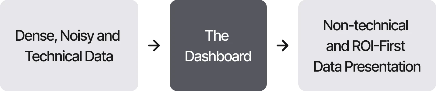
Dense Data for Non-Technical Readers
The products were technical hardware, so the data was full of engineering specs and performance numbers. Investors needed the opposite: their returns and the current state of their assets, up front, without wading through technical detail.
Three Roles in One Product
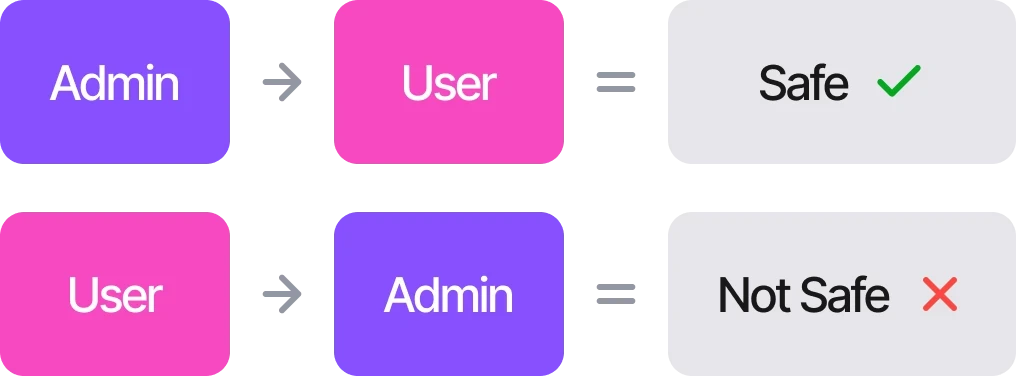
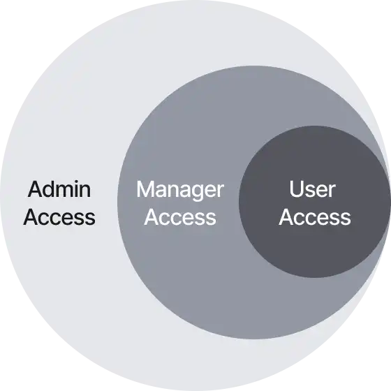
The platform had three kinds of users: investors, portfolio managers, and admins. They were arranged in layers. Admins oversee managers, managers oversee the portfolio persons under them, and each level sees less than the one above it.
Showing the wrong data or controls to the wrong role could cause real financial and operational damage. The platform directly affects revenue, so it had to be reliable both in how it worked and in how it looked.
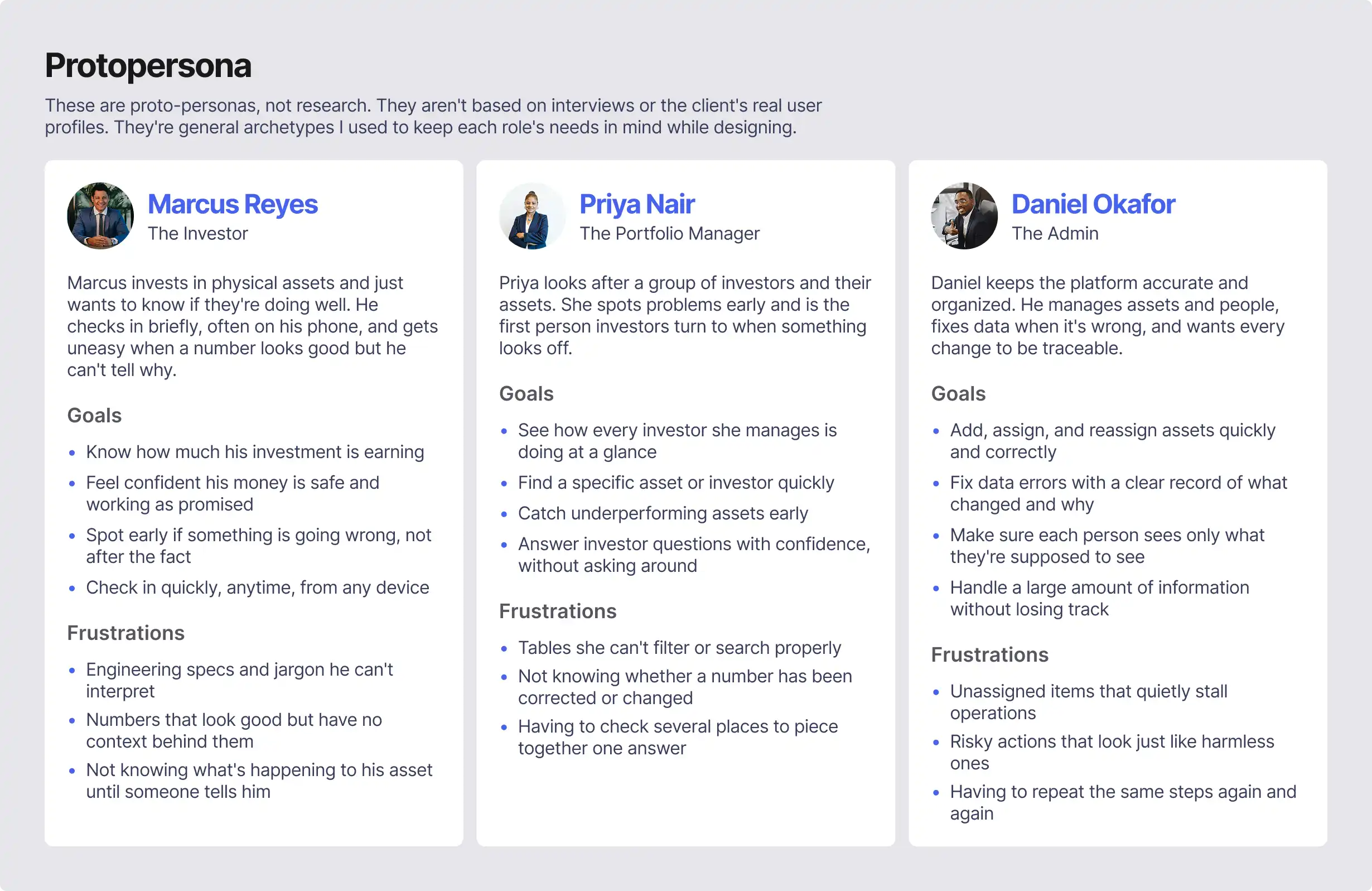
I didn't have access to the real users, so I sketched three general archetypes to keep each role's needs in front of me while designing.
User Journeys
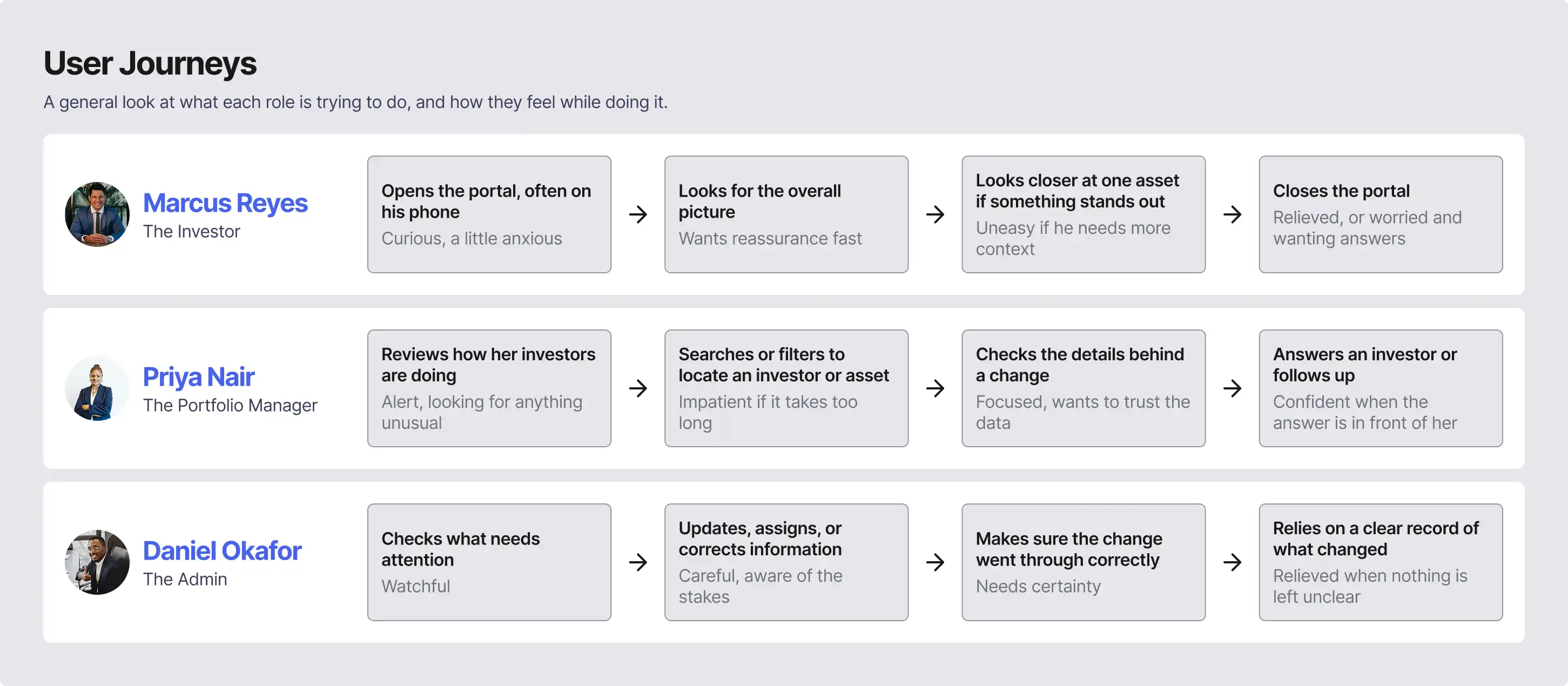
The real user flows are under NDA, so here's the simpler picture.
These journeys are sketches from my imagination, not research. I used them as a mood check while designing. For every screen, I asked one simple question: will this leave someone calmer, or more annoyed, than when they arrived?
Design Process
The CTO gave me a set of wireframes and a large amount of data to display. Both were confidential, and both were messy.
My job was deciding how to present each one so a user would know exactly what they were reading.
A wrong chart for a metric is enough to leave someone confused about their own investment, and that became the biggest part of my work.
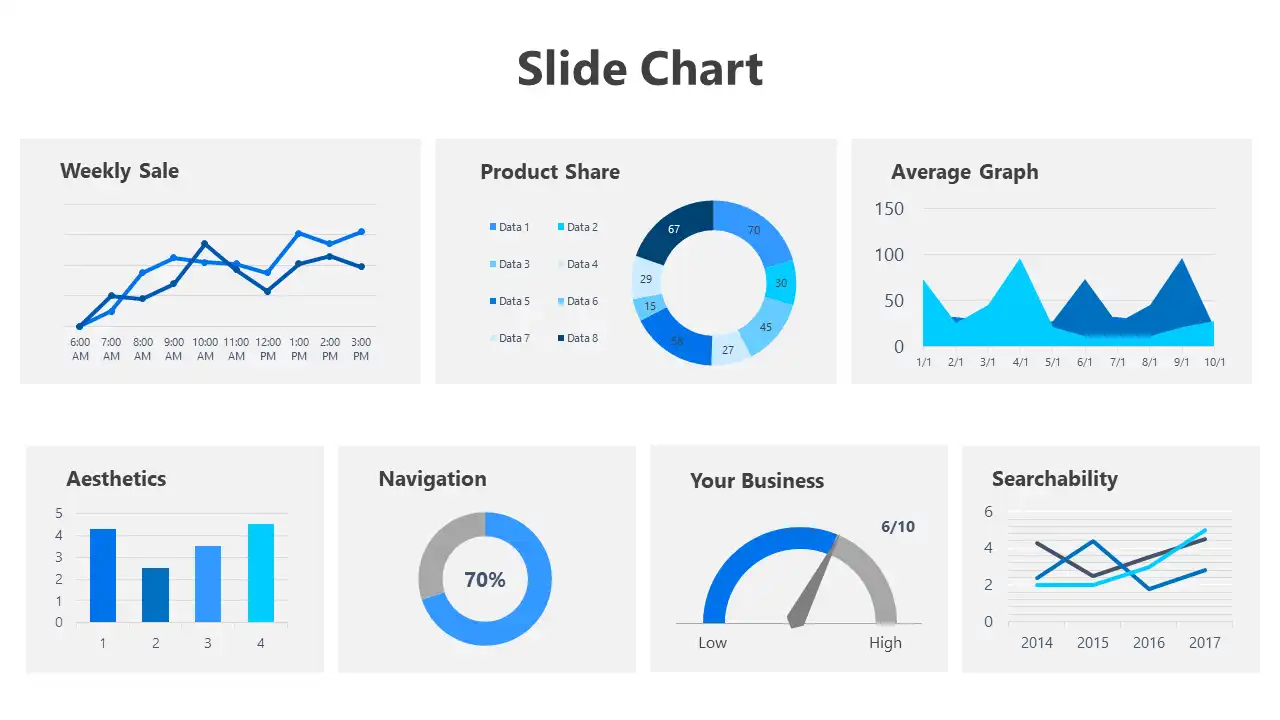
Trimming the Brief Down
Because the client's wireframes were confidential and hard to read, I worked backward. For each page, I pulled out just a list of the metrics that had to be there and ignored how they were laid out. That gave me a clear view of how the pages related to each other.
Only then did I make a rough wireframe of where each piece of information would go.
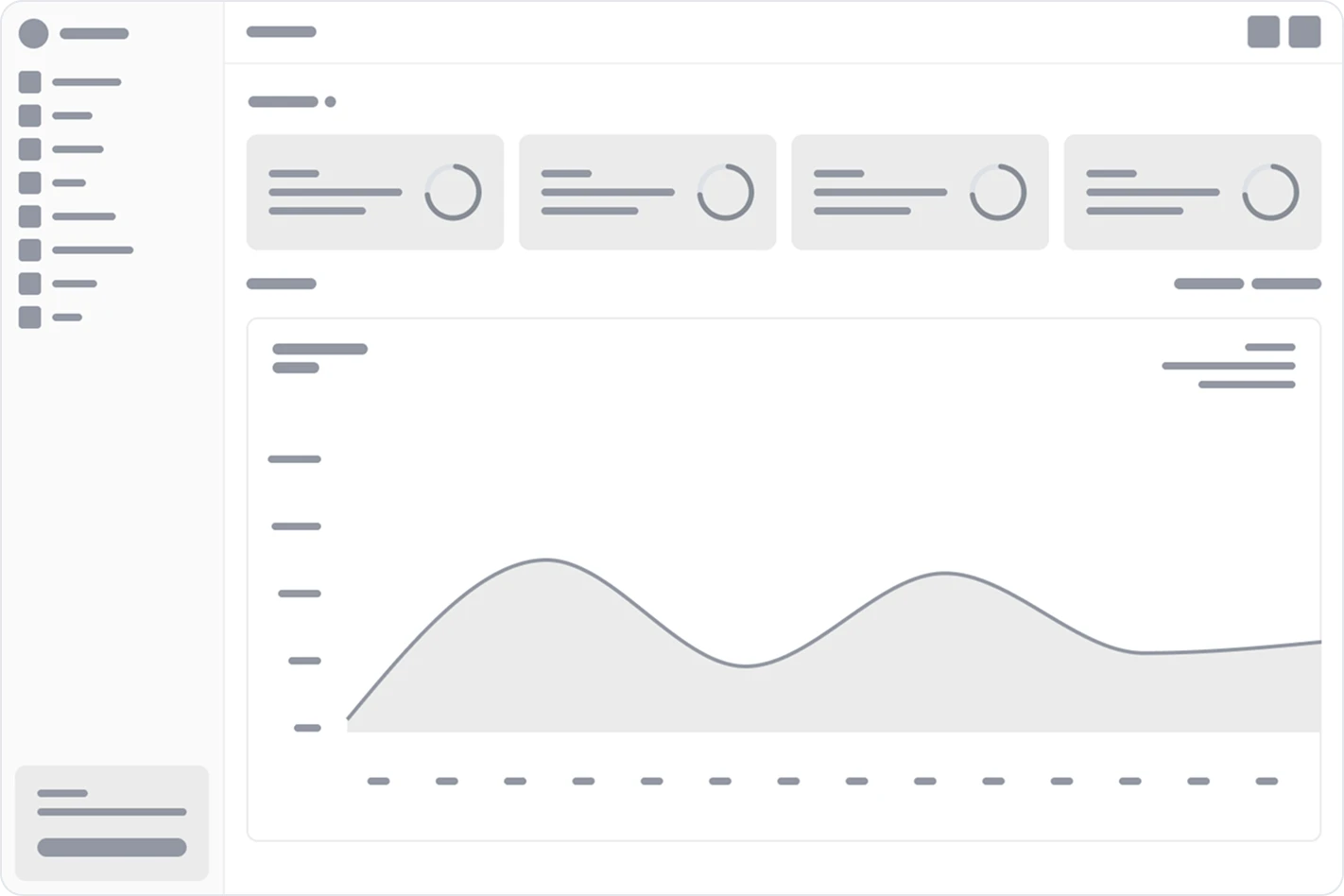
Moodboard
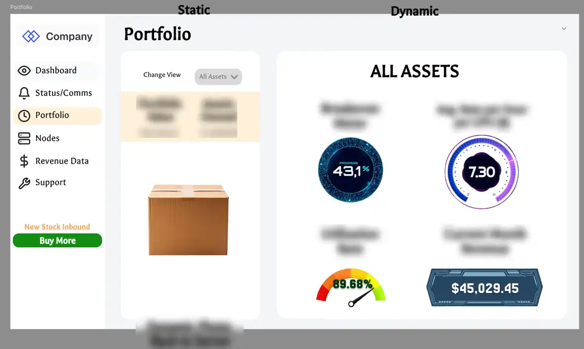
The client gave me a reference too. It's not the best one, but I understood what they meant, and the skeleton they were after was clear.
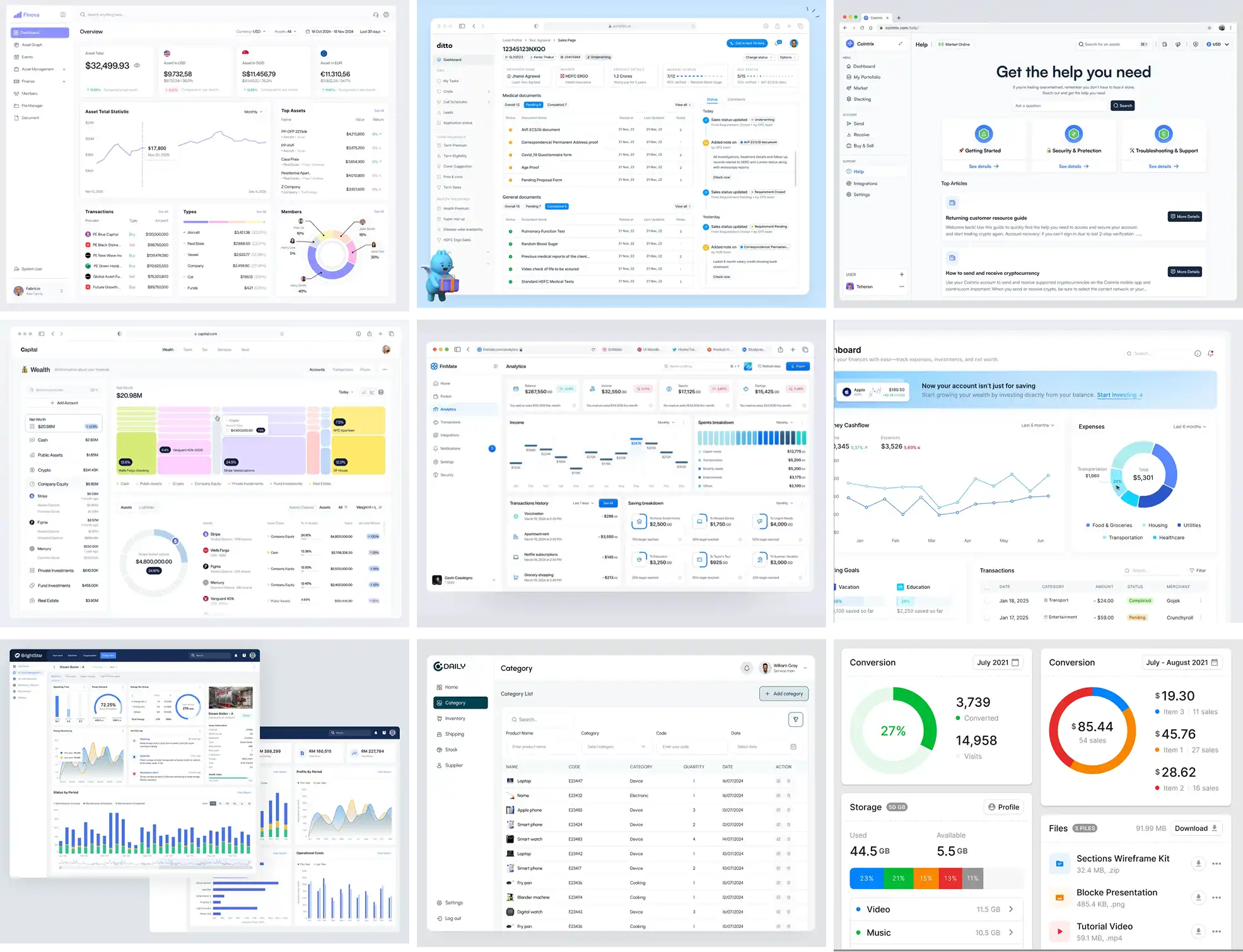
So I made my own moodboard from real visual references, and I used it to search for something specific: information hierarchy and placement.
Choosing Shadcn (and What I Gave Up)
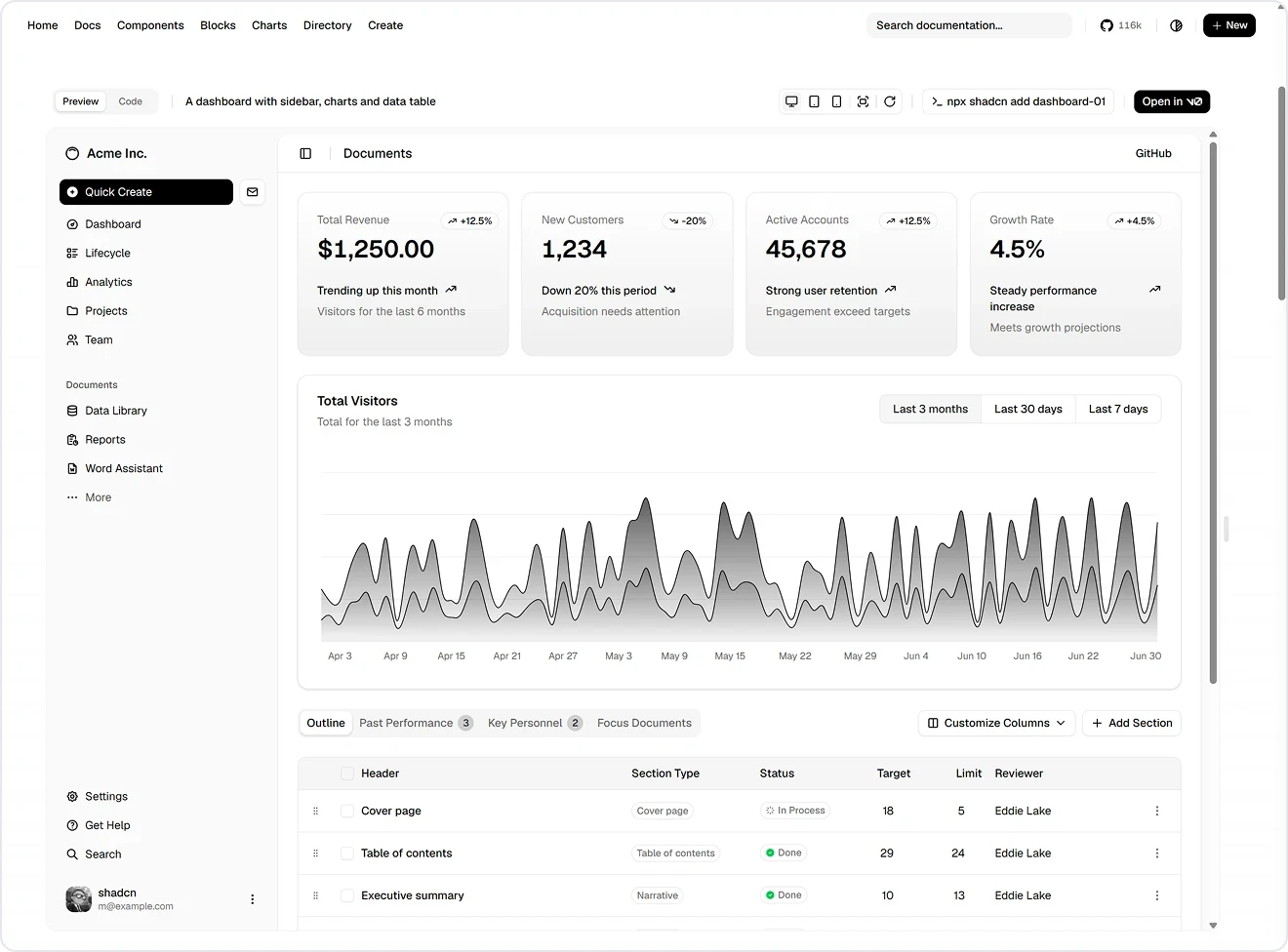
Given the deadline and the reliability requirements, we chose an existing component library over building our own.
After discussing it with the client, we went with Shadcn for its broad set of components, its predictable patterns, and its documentation, which would make handoff smoother for developers.
Filling the Gaps with Custom Components
Shadcn is comprehensive, but some metrics were better shown in a different way. So I made custom cards and layouts for those metrics.

Designing the Dashboard
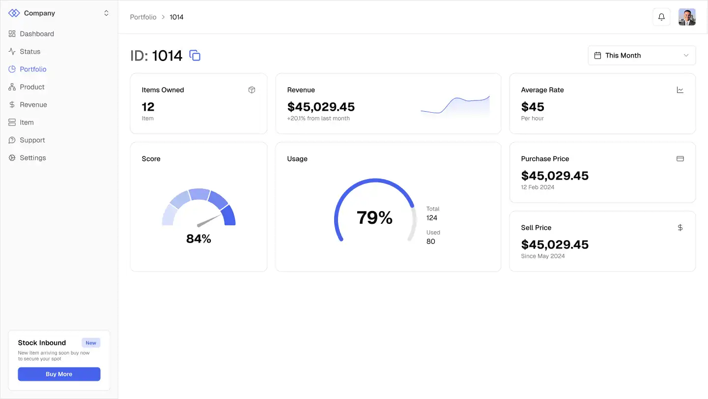
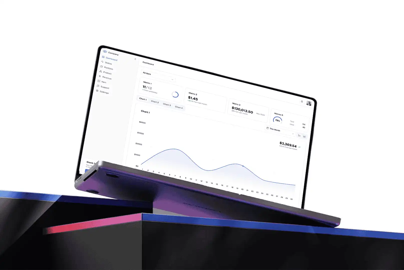
The dashboard had eight metrics to show. Showing all eight as cards would have been overwhelming.
So I split them:
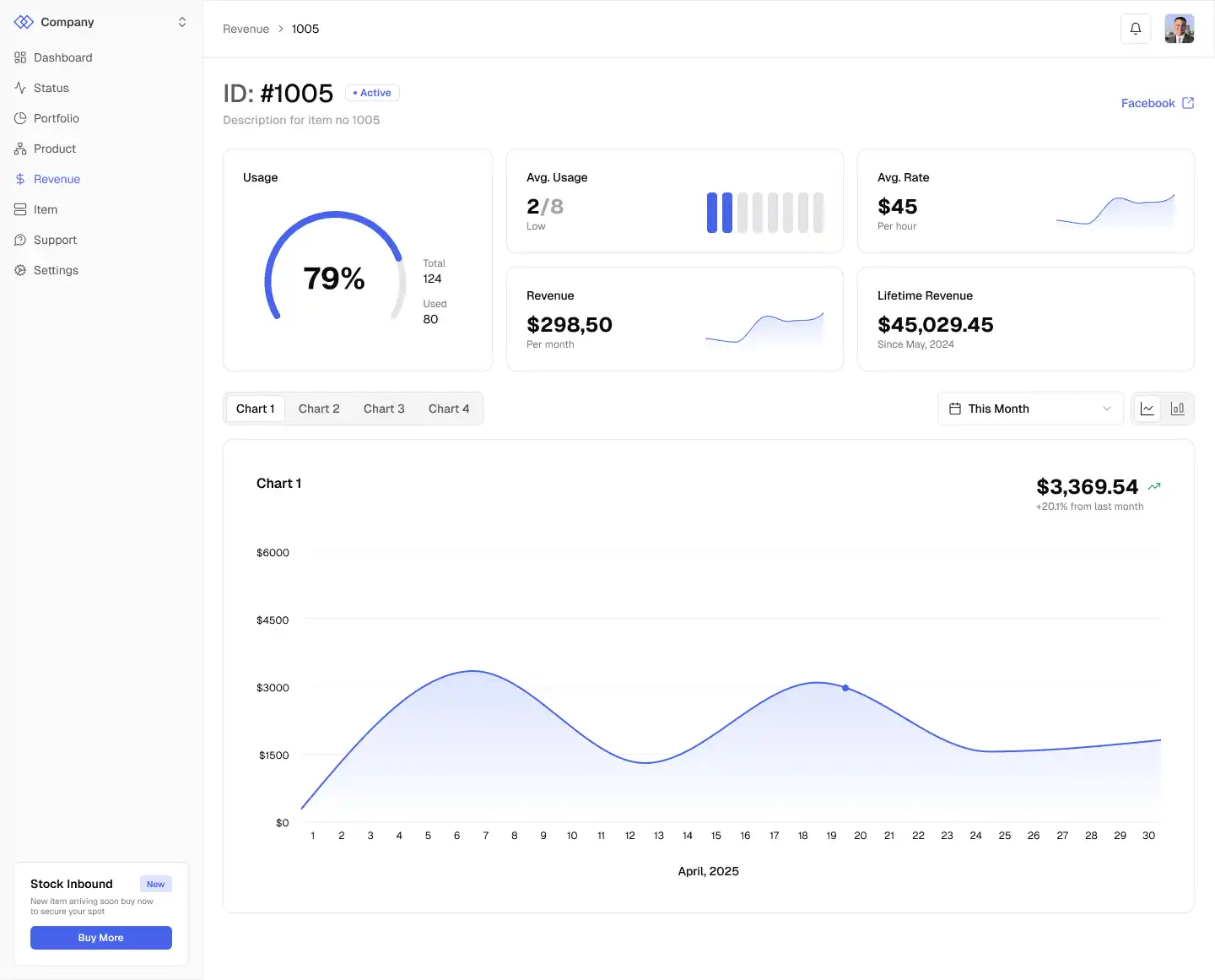
Four fixed cards on top. These are the most important numbers, and they sit in the top left, where people look first.
One large chart below, with tabs for the other four metrics. One chart holds all four instead of four separate ones.
A time range toggle placed inline with the tabs, so it's clear it only changes what's below.
An asset dropdown at the very top. By default it shows all assets, and you can switch to specific ones.
The idea was to show only what's needed at first glance and let people reveal more when they want it.

Small Trend Graphs Inside the Cards
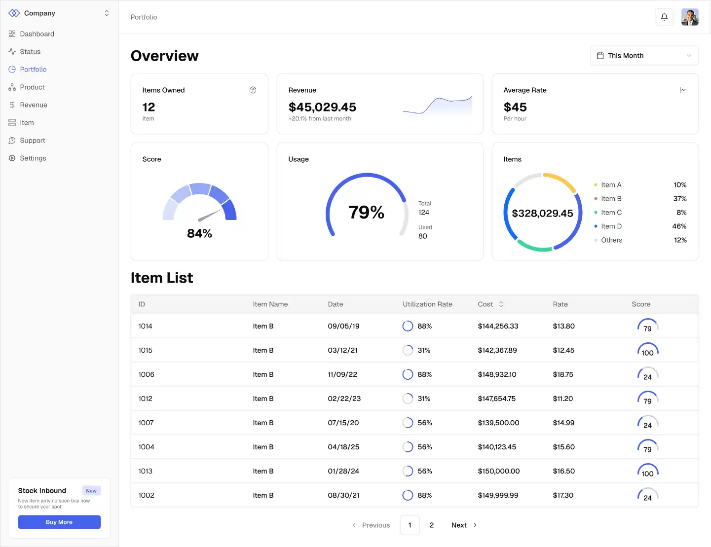
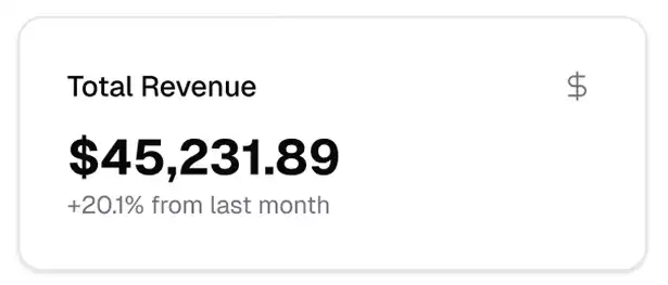
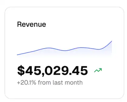
The standard Shadcn metric card shows a name, a value, and the change since last month. That's not enough for investing. "Up 20% from last month" only compares two points in time. It doesn't show what happened in between.
That number could be a steady climb, or a sharp spike followed by two weeks of decline, and the card would look the same in both cases.
I added a small trend graph inside each card. It's just a glimpse and not a full chart, so it still fits in the same space.
Filters That Remember
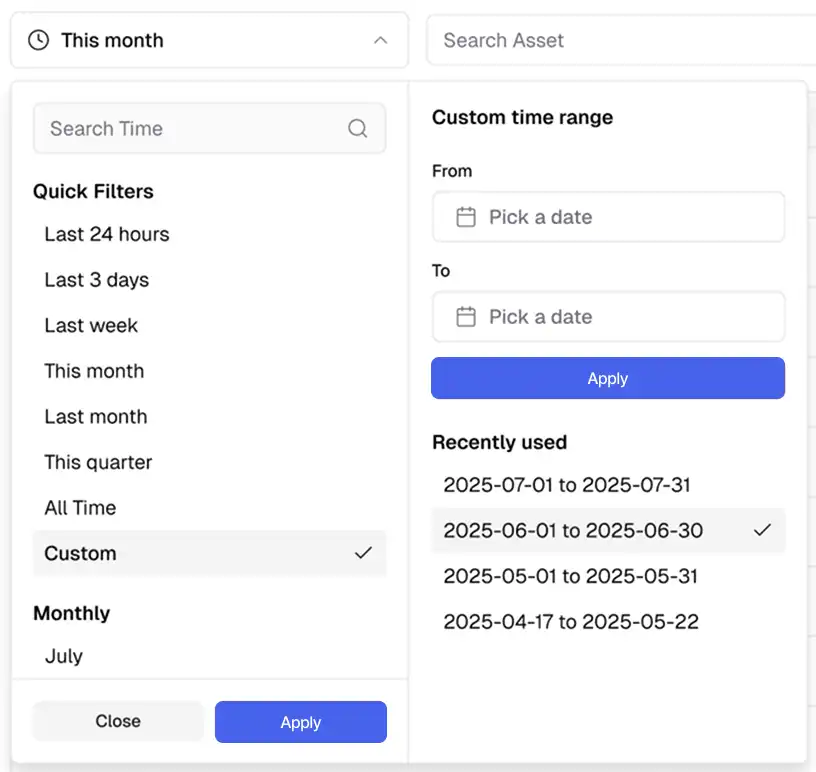
Beyond quick ranges like the last 24 hours, three days, a week, or a month, I designed a custom date range picker for a specific start and end date.
I also added a recently used list, so someone who tracks the same date range every time doesn't have to pick the dates again.
Designing Around Roles
Because admins can see and do more than everyone else, I built from the bottom up. I started with the investor view, which is safe for everyone, and only then layered the admin capabilities on top. That way, nothing sensitive could slip into the base experience.
Corrections That Leave a Trail
Data entry isn't perfect, so admins need to correct data manually. That's an intrusive operation, and the platform needed to be clear about when it happens.
We trust our admins' judgment, so this wasn't about doubt. It was about transparency.
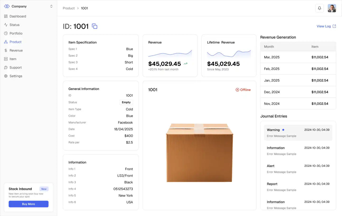
A small dot appears next to the asset name when data has been corrected.
Hovering shows that it was edited, with a link to the details.
Admins make changes through a correction ticket.
Every correction is stored in a table and can be downloaded as a receipt with a timestamp.

Assigning Assets
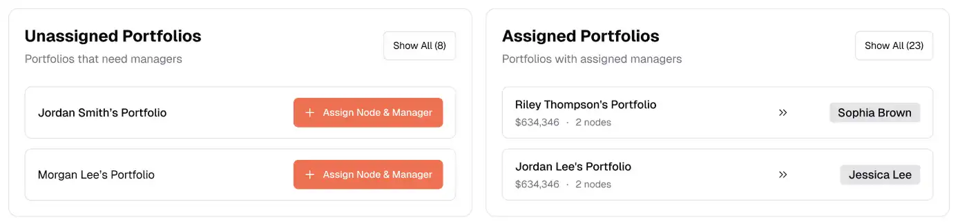
When an asset is created, it goes to an investor, and that investor is assigned to a portfolio manager. Unassigned portfolios can't operate properly, so I wanted assigning them to be fast.
A persistent notice shows the two most recent unassigned portfolios.
A counter shows how many are unassigned, with a button to see all of them.
Once assigned, the button becomes "Reassign" and drops to a secondary style, because reassigning matters less than assigning.
Every assignment is recorded in a log.
I also designed a screen for blocking access.
Smaller Decisions
Some details from the investor side:
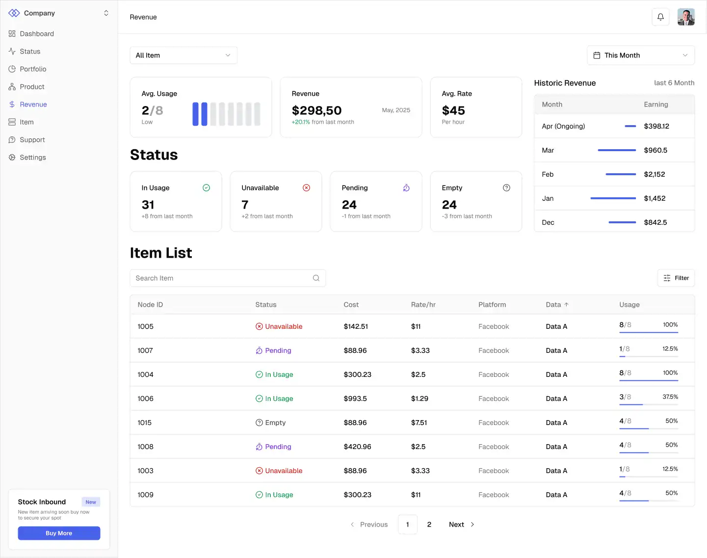
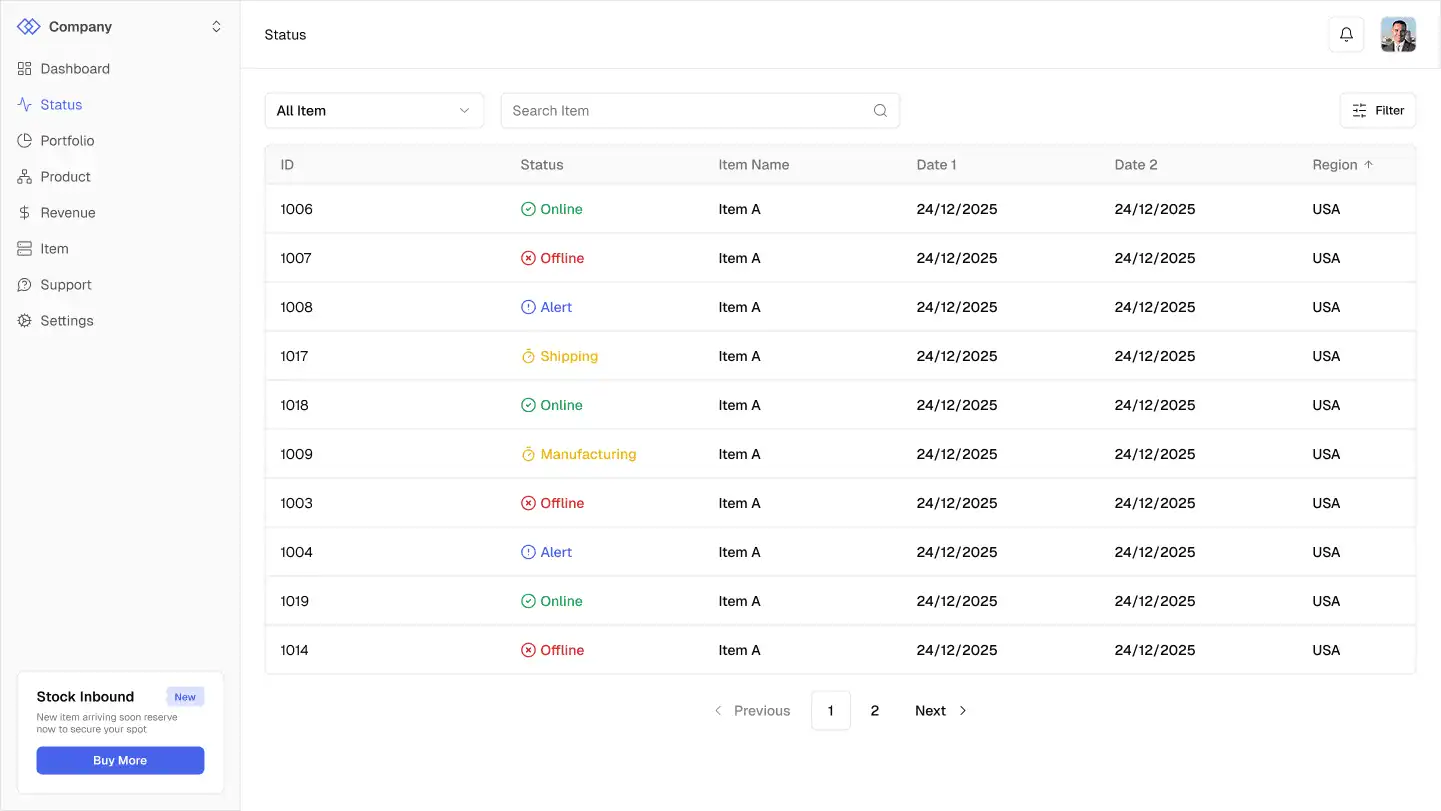
Status uses a bright, prominent color. Status is the first thing an investor wants to know, ahead of revenue.
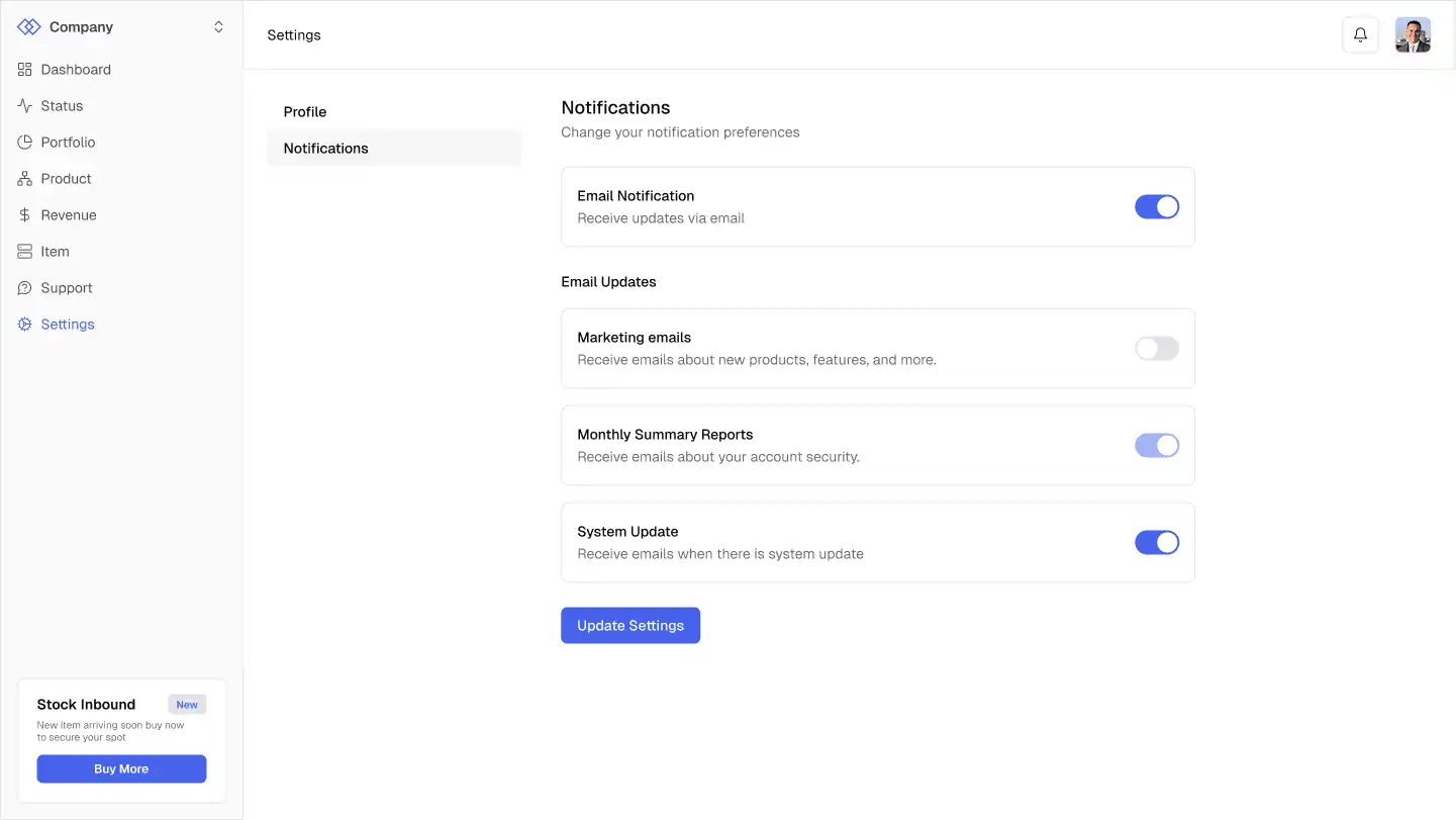
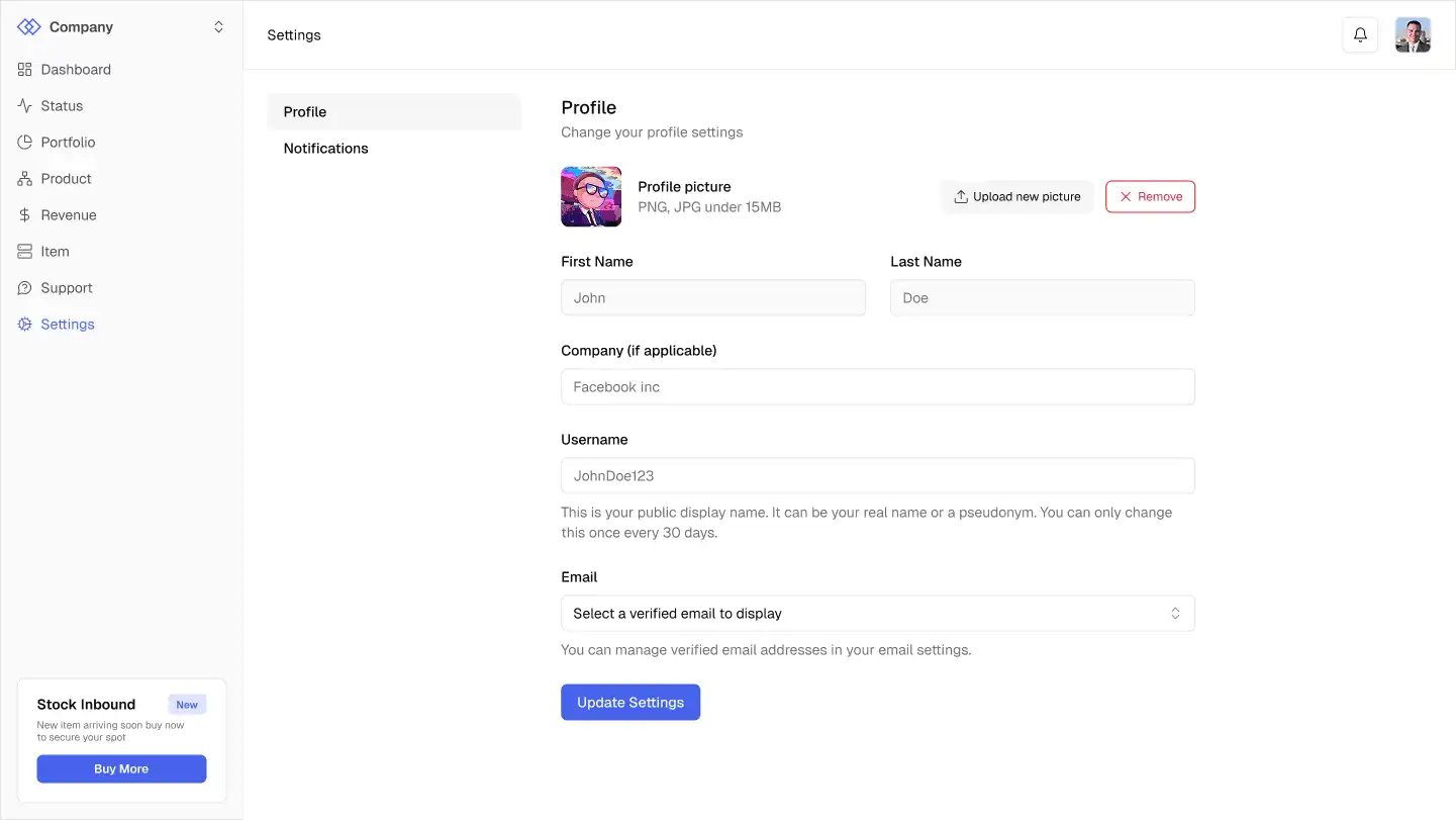
Settings are split into Profile and Notifications tabs instead of one long page.
Some profile fields are locked, like first and last name. That was an engineering constraint, since those fields are tied to the system, so users can only change things like email, username, and profile picture.
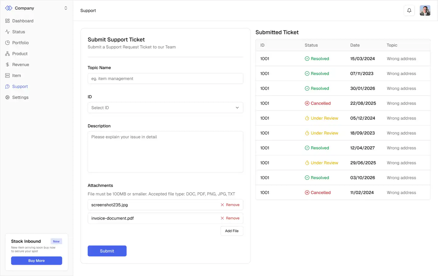
A ticket screen lets users submit a complaint or question and see what they've submitted.
Dark Mode and Screen Sizes
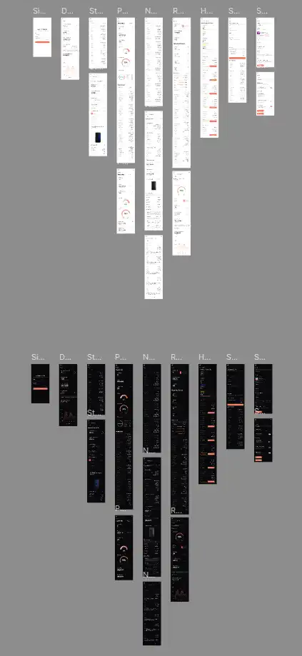
I designed dark mode along with tablet and mobile layouts. On tablet, the sidebar mostly just collapses. On mobile, the dashboard is completely different, because many investors wanted to check their assets from their phones.
Prototype and Feedback
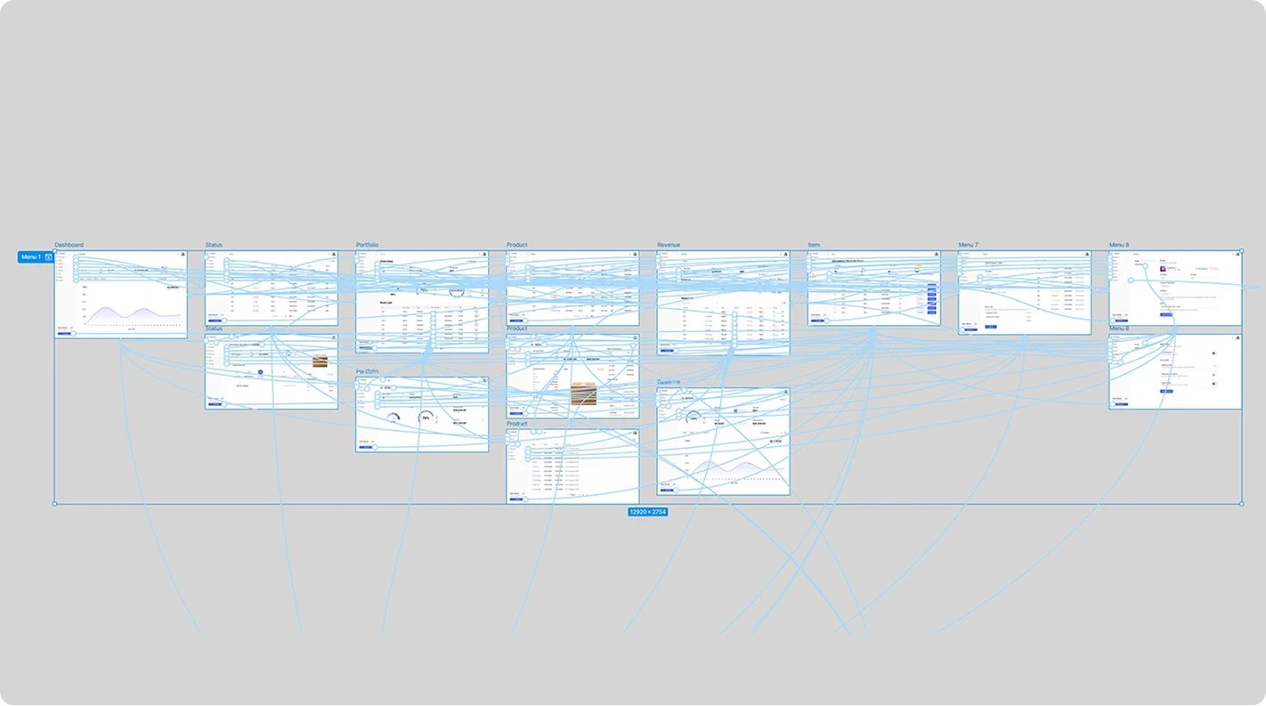
For the prototype I used Figma's built-in features, which kept everything in one tool and saved time.
Feedback
The first version wasn't perfect. Feedback came from the investor relations manager, who presented the designs to real stakeholders and investors and came back with what they said. Here's what changed.
Things I Had Left Out
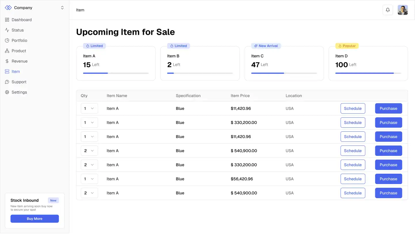
Filters on every column. In the main asset table, I had skipped filters for some fields because I thought they'd be redundant. I was wrong. They needed all of them.
A missing column. I left out a column in the investor's asset table that I thought was minor. It held a shorthand code that I didn't even understand, but every investor knows it. It went back in.
Individual assets on the dashboard. I had only designed the "all assets" view. Investors wanted to look at a single asset too.

Things I Added That Were Cut
A search bar on the dashboard. I added a general search at the top, and it was removed as unnecessary, partly because of implementation time.
A message box. A screen from the wireframes had an inbound message box. They wanted that screen to focus on one thing, so it also removed.
Things That Needed to Be More Specific
Shipment tracking. I made it very simple, just a timestamp and a shipped date. After feedback, they wanted predefined messages, like a clear statement that an item has shipped to certain location. The client provides those messages, since they know what information exists in the tracking.

Things in the Wrong Order
Metric order. I arranged one screen using my own understanding of investing. After feedback, one metric turned out to be more important than I'd placed it. Since people read left to right, we reordered everything from most important on the left to least important on the right.
Result
The portal was delivered on time, and the handoff to developers went smoothly, helped by the pre-built component library and by choosing reliability over visual flair.
In total its about 15 primary screens for investors, and around 64 for the admin panel once you count edge cases, forms, and validations. The portfolio manager view was a little smaller than admin. All of it came in dark mode, with tablet and mobile layouts for the investor side.
The client also kept working with me. It led to about two more projects afterward, and the CTO told me himself that they trust me. This is a large company, and that meant a lot to me.
[Visual: sanitized selection of key screens, including dashboard, admin, and mobile]
Reflection
Looking back, the split made the collaboration work. The investor relations manager understands how investors think in business terms: which numbers they care about.
I understand how users take in information: what context they need so they don't have to open another page to understand a number.
He'd say what mattered, and I'd figure out how to show it. Then I'd turn that into something the engineers could build from.
What I Would Do Differently
I couldn't see how the feedback was gathered. Feedback reached me through the investor relations manager, who presented the designs to stakeholders and investors and came back with what they said.
Some real user testing may have happened behind the scenes, but the project was confidential, and I was never shown how the feedback was collected or what was said word for word.
He's smart, and I'm not doubting him, but interpretation can drift. Next time, I'd ask for real quotes, or at least a written summary of what came out of his presentations
Conclusion
This project taught me that my value wasn't in deciding what the data was. The client knew that better than I did. It was in deciding how to show it, so that a user could understand something complicated in a glance.
Some of my best decisions were small ones, like a mini trend graph or a dot next to a corrected number. And some of my worst assumptions, like which columns didn't matter, were fixed because I had people around me who knew things I didn't.
This project was completed under NDA. Client details are confidential, and every screen shown uses dummy data.
Context
A cloud infrastructure company needed a dedicated portal where investors could monitor the performance of the physical computing hardware they own. The company's own portfolio managers and admins needed to run the same platform behind the scenes.
This is a big company, and I was an outside contractor. In early 2025, I started with a small onboarding redesign, then a second one. Then the CTO reached out directly and asked me to design the whole investor portal from scratch.
Results
There were three of us: me, an engineering representative, and the investor relations manager. We met every week, and sometimes twice a week.
That small crew got the job done. The portal shipped on time, with 50+ screens once you count every edge case, form, and validation. It also came in dark mode, with tablet and mobile layouts.
It wasn't a clean run, though. Feedback reached me through one person instead of straight from users, and a few of my confident guesses turned out to be wrong.
The Problem
Dense Data for Non-Technical Readers
The products were technical hardware, so the data was full of engineering specs and performance numbers. Investors needed the opposite: their returns and the current state of their assets, up front, without wading through technical detail.
Three Roles in One Product
The platform had three kinds of users: investors, portfolio managers, and admins. They were arranged in layers. Admins oversee managers, managers oversee the portfolio persons under them, and each level sees less than the one above it.
Showing the wrong data or controls to the wrong role could cause real financial and operational damage. The platform directly affects revenue, so it had to be reliable both in how it worked and in how it looked.
I didn't have access to the real users, so I sketched three general archetypes to keep each role's needs in front of me while designing.
User Journeys
The real user flows are under NDA, so here's the simpler picture.
These journeys are sketches from my imagination, not research. I used them as a mood check while designing. For every screen, I asked one simple question: will this leave someone calmer, or more annoyed, than when they arrived?
Design Process
The CTO gave me a set of wireframes and a large amount of data to display. Both were confidential, and both were messy.
My job was deciding how to present each one so a user would know exactly what they were reading.
A wrong chart for a metric is enough to leave someone confused about their own investment, and that became the biggest part of my work.
Trimming the Brief Down
Because the client's wireframes were confidential and hard to read, I worked backward. For each page, I pulled out just a list of the metrics that had to be there and ignored how they were laid out. That gave me a clear view of how the pages related to each other.
Only then did I make a rough wireframe of where each piece of information would go.
Moodboard
The client gave me a reference too. It's not the best one, but I understood what they meant, and the skeleton they were after was clear.
So I made my own moodboard from real visual references, and I used it to search for something specific: information hierarchy and placement.
Choosing Shadcn (and What I Gave Up)
Given the deadline and the reliability requirements, we chose an existing component library over building our own.
After discussing it with the client, we went with Shadcn for its broad set of components, its predictable patterns, and its documentation, which would make handoff smoother for developers.
Filling the Gaps with Custom Components
Shadcn is comprehensive, but some metrics were better shown in a different way. So I made custom cards and layouts for those metrics.
Designing the Dashboard
The dashboard had eight metrics to show. Showing all eight as cards would have been overwhelming.
So I split them:
Four fixed cards on top. These are the most important numbers, and they sit in the top left, where people look first.
One large chart below, with tabs for the other four metrics. One chart holds all four instead of four separate ones.
A time range toggle placed inline with the tabs, so it's clear it only changes what's below.
An asset dropdown at the very top. By default it shows all assets, and you can switch to specific ones.
The idea was to show only what's needed at first glance and let people reveal more when they want it.
Small Trend Graphs Inside the Cards
The standard Shadcn metric card shows a name, a value, and the change since last month. That's not enough for investing. "Up 20% from last month" only compares two points in time. It doesn't show what happened in between.
That number could be a steady climb, or a sharp spike followed by two weeks of decline, and the card would look the same in both cases.
I added a small trend graph inside each card. It's just a glimpse and not a full chart, so it still fits in the same space.
Filters That Remember
Beyond quick ranges like the last 24 hours, three days, a week, or a month, I designed a custom date range picker for a specific start and end date.
I also added a recently used list, so someone who tracks the same date range every time doesn't have to pick the dates again.
Designing Around Roles
Because admins can see and do more than everyone else, I built from the bottom up. I started with the investor view, which is safe for everyone, and only then layered the admin capabilities on top. That way, nothing sensitive could slip into the base experience.
Corrections That Leave a Trail
Data entry isn't perfect, so admins need to correct data manually. That's an intrusive operation, and the platform needed to be clear about when it happens.
We trust our admins' judgment, so this wasn't about doubt. It was about transparency.
A small dot appears next to the asset name when data has been corrected.
Hovering shows that it was edited, with a link to the details.
Admins make changes through a correction ticket.
Every correction is stored in a table and can be downloaded as a receipt with a timestamp.
Assigning Assets
When an asset is created, it goes to an investor, and that investor is assigned to a portfolio manager. Unassigned portfolios can't operate properly, so I wanted assigning them to be fast.
A persistent notice shows the two most recent unassigned portfolios.
A counter shows how many are unassigned, with a button to see all of them.
Once assigned, the button becomes "Reassign" and drops to a secondary style, because reassigning matters less than assigning.
Every assignment is recorded in a log.
I also designed a screen for blocking access.
Smaller Decisions
Some details from the investor side:
Status uses a bright, prominent color. Status is the first thing an investor wants to know, ahead of revenue.
Settings are split into Profile and Notifications tabs instead of one long page.
Some profile fields are locked, like first and last name. That was an engineering constraint, since those fields are tied to the system, so users can only change things like email, username, and profile picture.
A ticket screen lets users submit a complaint or question and see what they've submitted.
Dark Mode and Screen Sizes
I designed dark mode along with tablet and mobile layouts. On tablet, the sidebar mostly just collapses. On mobile, the dashboard is completely different, because many investors wanted to check their assets from their phones.
Prototype and Feedback
For the prototype I used Figma's built-in features, which kept everything in one tool and saved time.
Feedback
The first version wasn't perfect. Feedback came from the investor relations manager, who presented the designs to real stakeholders and investors and came back with what they said. Here's what changed.
Things I Had Left Out
Filters on every column. In the main asset table, I had skipped filters for some fields because I thought they'd be redundant. I was wrong. They needed all of them.
A missing column. I left out a column in the investor's asset table that I thought was minor. It held a shorthand code that I didn't even understand, but every investor knows it. It went back in.
Individual assets on the dashboard. I had only designed the "all assets" view. Investors wanted to look at a single asset too.
Things I Added That Were Cut
A search bar on the dashboard. I added a general search at the top, and it was removed as unnecessary, partly because of implementation time.
A message box. A screen from the wireframes had an inbound message box. They wanted that screen to focus on one thing, so it also removed.
Things That Needed to Be More Specific
Shipment tracking. I made it very simple, just a timestamp and a shipped date. After feedback, they wanted predefined messages, like a clear statement that an item has shipped to certain location. The client provides those messages, since they know what information exists in the tracking.
Things in the Wrong Order
Metric order. I arranged one screen using my own understanding of investing. After feedback, one metric turned out to be more important than I'd placed it. Since people read left to right, we reordered everything from most important on the left to least important on the right.
Result
The portal was delivered on time, and the handoff to developers went smoothly, helped by the pre-built component library and by choosing reliability over visual flair.
In total its about 15 primary screens for investors, and around 64 for the admin panel once you count edge cases, forms, and validations. The portfolio manager view was a little smaller than admin. All of it came in dark mode, with tablet and mobile layouts for the investor side.
The client also kept working with me. It led to about two more projects afterward, and the CTO told me himself that they trust me. This is a large company, and that meant a lot to me.
[Visual: sanitized selection of key screens, including dashboard, admin, and mobile]
Reflection
Looking back, the split made the collaboration work. The investor relations manager understands how investors think in business terms: which numbers they care about.
I understand how users take in information: what context they need so they don't have to open another page to understand a number.
He'd say what mattered, and I'd figure out how to show it. Then I'd turn that into something the engineers could build from.
What I Would Do Differently
I couldn't see how the feedback was gathered. Feedback reached me through the investor relations manager, who presented the designs to stakeholders and investors and came back with what they said.
Some real user testing may have happened behind the scenes, but the project was confidential, and I was never shown how the feedback was collected or what was said word for word.
He's smart, and I'm not doubting him, but interpretation can drift. Next time, I'd ask for real quotes, or at least a written summary of what came out of his presentations
Conclusion
This project taught me that my value wasn't in deciding what the data was. The client knew that better than I did. It was in deciding how to show it, so that a user could understand something complicated in a glance.
Some of my best decisions were small ones, like a mini trend graph or a dot next to a corrected number. And some of my worst assumptions, like which columns didn't matter, were fixed because I had people around me who knew things I didn't.
Gallery