UX Audit
The North Face Website
Evaluator
Syahrul Miftah
audit Date
Product
E-commerce website
Scope
Navigation and Homepage

Purpose
This is a self initiated and independent UX audit of The North Face’s e-commerce website, written to identify usability problems and explain how I’d approach fixing them. I’m not affiliated with the company.
Approach
I reviewed the site by hand against established usability principles. Then i rated each problem on Nielsen’s severity scale. The higher the number, the sooner it should be fixed.
Format
Each problem comes with a description, a recommendation, and a reference where research supports it. The recommendations are starting points to test, not final solutions.
Summary
6
SEVERITY 0
Not a usability problem
8
SEVERITY 1
Cosmetic problem only
11
SEVERITY 2
Minor usability problem
6
SEVERITY 3
Major usability problem
3
SEVERITY 4
USABILITY CATASTROPHE
Findings

1
Missing Location Detection
SEVERITY 3 · Major usability problem
Finding
The location is automatically set to the United States. Baymard’s research says that having to select a location manually to get accurate cart information and localized address fields is burdensome and unnecessary for most users, which supports detecting the country automatically. Here, the default is the US instead of the visitor’s actual location, which may cause problems with product availability and shipping for visitors outside the US.
Recommendations
Ask users for their location so they shop from their own country instead of defaulting to the US. Reference: baymard.com/guidelines/573-country-selection-via-ip-geotargeting
Reference
2
Sticky Promo Bar Hides on Scroll
SEVERITY 0 · Not a usability problem
Finding
There's this small notification box above the nav bar, usually offering a coupon or a promo, and it hides when you scroll down and reappears when you scroll up. That's a good practice and worth calling out.
Recommendations
-

3
Inconsistent Order of Dynamic Links
SEVERITY 1 · Cosmetic problem only
Finding
Men's and Women's dropdowns expectedly show different products, since some products are exclusive to each. But the dynamic links themselves (Bestsellers, New Arrivals, etc.) appear in a different order between the two. This caused momentary confusion, it looked at first like Bestsellers didn't exist for Men's or New Arrivals didn't exist for Women's, when actually all links exist, just reordered. (This issue also occur on “footwear and Bags & Gear”)
Recommendations
Keep the link order consistent across Men's and Women's dropdowns. Sites like Patagonia and Columbia Sportswear use the same exact structure and placement for both, with the only difference being the actual product content, not the order of the links themselves.
4
Navigation Menu Lacks Visual Separation From Background
SEVERITY 2 · Minor usability problem
Finding
The menu background is white at about 90% opacity and the page background is also white, so the menu blends in, with only a thin border as separator. NN/g’s mega menu article notes that low-vision users with screen magnifiers may see only part of a menu and miss that more options exist, and a strong visual signal for the menu’s borders helps with this. A thin border on a white-on-white menu is a weak signal.
Recommendations
Make the menu’s edges clearly visible, for example with a darker overlay or a slight blur on the page behind it while the menu is open.
Reference

5
Mega menu Contains a Duplicate Sublink
SEVERITY 3 · Major usability problem
Finding
The Back to Campus top nav item has a dropdown containing New Arrivals, Back to Campus, Backpacks, and Backpack Patches, so the same name appears twice. NN/g’s mega menu guidelines say to show each choice only once, because duplicate options make users wonder whether the two entries are the same or different. That is the confusion here: it’s unclear whether the inner link goes to the same page as the parent or to something different.
Recommendations
Replace the repeated “Back to Campus” link inside the Back to Campus dropdown with something that adds a new category, such as other back-to-school items alongside New Arrivals, or a split by age group or gender. The top-level item itself can stay as the link to the main page. Reference: http://www.nngroup.com/articles/mega-menus-work-well/
Reference
6
Sub-links Are Placed Below the Category Cards, Making Them Nearly Invisible
SEVERITY 4 · USABILITY CATASTROPHE
Finding
Back to Campus shows four category cards (New Arrivals, Back to Campus, Backpacks, Backpack Patches). Below them is a separate “Shop Back to Campus” section with the actual product sub-links (metallic backpacks, women’s backpacks, and so on). Every other dropdown on the site puts its shop and category links at the top, with imagery below, so this one breaks the pattern. After roughly 12+ hours of searching the site, I missed this section entirely and only noticed it much later. NN/g’s mega menu article advises putting the most important or most-used group in the top-left corner. Here the shop links sit at the bottom, where they are easy to miss. This also ties back to #4
Recommendations
Shrink the category imagery and move the shop links above it, so this dropdown follows the same pattern as every other dropdown on the site (links on top, imagery below). Reference: http://www.nngroup.com/articles/mega-menus-work-well/
Reference
7
Large Hover Menu Makes Users Feel Stuck
SEVERITY 4 · USABILITY CATASTROPHE
Finding
The hover menus in the top bar, especially Back to Campus, span the entire vertical height of the screen. The only way out is moving the cursor out of a very small area, which makes the menu hard to leave and easy to open by accident. NN/g’s guidance on hover menus says to wait about half a second before opening, and keep the menu open until the pointer has been outside both the nav item and the menu for about half a second. It also notes that finicky show and hide behavior hurts people with motor impairments. A menu that is easy to open and hard to leave works against this.
Recommendations
Don’t let the hover menu span the full height of the screen, and make it easier to leave: it should close once the pointer has been outside it for a short moment.
Reference

8
Popular Searches Under-Utilized
SEVERITY 1 · Cosmetic problem only
Finding
The search pop-up shows a query field plus popular searches, which is a good approach for users who don’t know what to search for. But only three are shown. Baymard’s autocomplete research found that once a list goes past about 10 items on desktop, users start ignoring suggestions or spend too long reading them, so there is room to add a few more without overloading it. That research is about typed suggestions, so treat it as an upper limit, not a target.
Recommendations
Add a few more popular searches to help users who are unfamiliar with the products, keeping the list short enough to scan.
Reference
9
"You Might Also Like" Shown With No Search Context
SEVERITY 2 · Minor usability problem
Finding
The element are shown before any search has happened and there's no prior behavior for it to base itself on. Confusing to user and potentially degrade the integrity / meaning of the element itself (You Might Also Like)
Recommendations
Consider removing or relabeling this section on the homepage, and only show these below a specific product page or after user add some items to cart.
10
Search Popup Carries More Than Product Search
SEVERITY 0 · Not a usability problem
Finding
The search popup helps with more than product search. It offers shortcuts to Order Status, Ask TNF Agent, XPLR Pass, Find a Store, and Help, and it surfaces questions, alongside product recommendations. Baymard found that 34% of users tried to search for non-product content such as “return policy,” yet 15% of sites don’t support it, and it recommends including that content in results or taking users straight to the relevant page. Supporting these needs in search saves users from hunting through the footer. The product recommendations also fit well, because they take users straight to products.
Recommendations
Keep as is. One small check: make sure the shortcuts don’t crowd out product suggestions.
Reference
11
Membership Badge is ambiguous
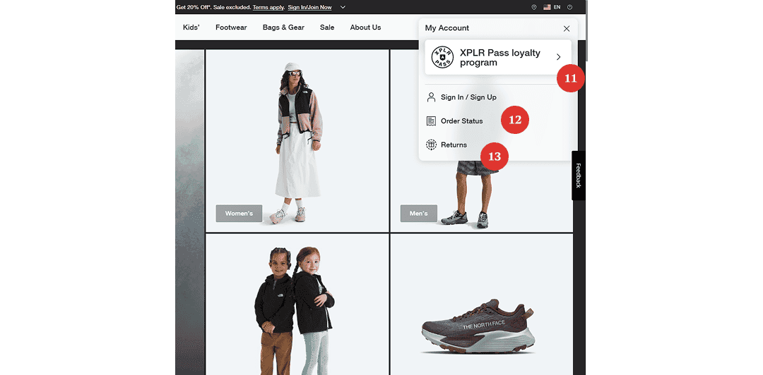
SEVERITY 2 · Minor usability problem
Finding
XPLR Pass on the account page only shows a right arrow, with no explanation of what the action is for. It isn’t clear whether it’s a promotion to join the membership or a link to manage an existing one. NN/g’s research on link labels says link and button labels must set expectations that are met the moment the user clicks, and links must make sense on their own. An arrow alone sets no expectation at all.
Recommendations
Add context to the badge so users understand what it is and what it does. Replace the bare arrow with a short action label, such as “Join membership.”
Reference
12
Order status label is ambiguous
SEVERITY 0 · Not a usability problem
Finding
Order Status can track orders for guests who aren’t logged in, but the button copy doesn’t say so. NN/g advises writing links that are specific, set sincere expectations, and can stand alone. A clearer label and a short supporting line would meet that.
Recommendations
Use clearer copy for the button, such as “Check order status,” and add a short line underneath saying guests can use it without logging in.
Reference
13
“Returns” Link Misplaced in Account Navigation
SEVERITY 2 · Minor usability problem
Finding
The returns link goes to a separate page and is a utility link, in the same family as About Us or Terms of Service. It has nothing to do with the account. Baymard’s guideline on links to the return policy, shipping info, and order tracking says that hard-to-find returns and shipping information makes it harder for users to decide to buy. A related Baymard article says return and shipping information should always also be reachable from the footer.
Recommendations
Move the returns link out of the account menu and group it with the other utility links, in the top nav and in the footer.
Reference

14
No Item Preview on Cart Hover
SEVERITY 1 · Cosmetic problem only
Finding
Hovering the cart shows nothing, not even "0 items", and clicking always forces a full page navigation. Giving user a quick way to peek at their items in cart can improve user experience since user doesn’t have to click on cart and move to another page everytime they just need a quick glance on them
Recommendations
Provide a simple glance of how many item on cart while hovering.
15
Empty Cart Page Lacks Strong Visual Treatment
SEVERITY 3 · Major usability problem
Finding
The empty cart is plain text, with no imagery or call to action. NN/g’s article on empty states (written for complex applications, but the principle carries over) says an empty state can give users a direct pathway to a key task.
Recommendations
Add a clear next step to the empty cart, such as a button leading to curated picks, with a visual (illustration or photo) that matches the brand’s usual imagery.
Reference
16
Return Policy Line Has No Supporting Link
SEVERITY 3 · Major usability problem
Finding
Return Policy Line has no link to the full policy, so users have to guess the fine print before buying. Baymard’s guideline on return policy discoverability (rated Essential) says users often struggle to find return policies on product pages, causing anxiety and hesitation about buying. A returns claim with no link leaves the same gap and may reduce trust.
Recommendations
Add a link from the returns line to the full policy page.

17
Men's Hero Image Links to the Women's Page
SEVERITY 4 · USABILITY CATASTROPHE
Finding
Clicking a men’s-presenting image in the collage led to the same Back to Campus (women’s) page as the women’s images, not a men’s-specific page. NN/g’s research on information scent says users judge where a link will lead from its cues, and that images near a link add to its information scent. A men’s image leading to a women’s page breaks that expectation. Nielsen also notes that disappointing users too often with poor or misleading scent leads them to stop using a site.
Recommendations
Make sure each clickable image goes to the destination that matches what it shows. If all hero clicks are meant to go to one page, show only imagery for that page, or rotate men’s and women’s imagery over time instead of mixing both.
Reference
18
Underdeveloped Category Section With Wrong Button Hierarchy
SEVERITY 2 · Minor usability problem
Finding
Same primary button style as the hero above it, but this section serves a different purpose and shouldn't share that visual weight, and section overall feels thin and underdeveloped, no image or any visual aid to help understand each category better.
Recommendations
A ghost/secondary style buttons fits better here for category. And could use small boxes / card style section paired with imagery instead of bare buttons.

19
Well-Executed Card Section
SEVERITY 0 · Not a usability problem
Finding
Each card has a supporting image and two distinct ghost buttons (Women's / Men's). Visuals and layout work well here.
Recommendations
-
20
Three Primary Buttons Side-by-Side
SEVERITY 2 · Minor usability problem
Finding
Women's Sale / Men's Sale / Kids Sale all shown as primary, all at equal weight. More than one button next to each other shouldn't all be primary. Primary button should signal one important action. Left-to-right placement across the banner also forces the eye to travel further than needed;
Recommendations
Use secondary or ghost button for these items instead. Also consider stacking copy (heading, subheading, buttons) vertically and reserve the right side for visual/brand imagery. It should be easier to scan, plus, there would be more room for image.

21
Banner Image Doesn’t Match Its Message
SEVERITY 1 · Cosmetic problem only
Finding
Banner’s image choice is different from its context and doesn’t aid the story and the message that the banner carry. Image need to live up to its bold claim “New Sales Styles”.
Recommendations
Providing an actual new styles imagery would be helpful for user to understand the context of the banner better. This can improve scan-ability.
22
Clean Subcategory Cards
SEVERITY 0 · Not a usability problem
Finding
Subcategory section with product-first imagery with a simple label (Backpack, Tote, Mini Water Bottle Holder). Aesthetic and effective, overall its well designed.
Recommendations
-
23
No Hover Effect on Clickable Product Cards
SEVERITY 1 · Cosmetic problem only
Finding
There is no hover indicator on the clickable product cards. NN/g recommends always using some visual signifier on clickable elements, and not relying on hover alone to reveal one on primary elements. Without a hover state, users get one less cue about what is clickable. The effect is likely small, so this stays a minor issue.
Recommendations
Add a visible sign that cards and images are clickable. A hover state (for example, a slight opacity change) works as an extra cue, but not as the only one.
Reference
24
Heading too Small and Inconsistent
SEVERITY 2 · Minor usability problem
Finding
The section heading are too small and not bold enough to act as a heading properly. Either make it consistent with other headings or remove it all together. Also the spacing around the heading are too tight to easily distinguish it from nearby element.
Recommendations
Increase heading size and establish a proper heading hierarchy across the site. Also increase the spacing around it for easier separation from other section.

25
Broken/Empty Button and Ambiguous Section Purpose
SEVERITY 2 · Minor usability problem
Finding
The section reads “Discover bold, fresh colors...” but the button is a blank white rectangle with no text, which looks like a bug. Clicking it does lead to browsing by color, but nothing communicates that. NN/g’s guidance on link labels says link and button labels must set expectations that are met when the user clicks. A blank button sets none.
Recommendations
Add a text label to the button, and show several colors of the same product side by side (replacing the current image) so the “browse by color” idea is obvious.
Reference
26
Two Primary Buttons at Equal Weight
SEVERITY 1 · Cosmetic problem only
Finding
Same issue as the sale banner (20), two primary buttons next to each other.
Recommendations
One of the button need to be downgraded to secondary, based on the business’s priority.
27
Blurry Image
SEVERITY 1 · Cosmetic problem only
Finding
Low quality image makes user perceive the website quality as lower too. Blurry image also makes website content harder to understand by user.
Recommendations
Use proper high quality image and compress it to improve load times.
28
"Renewed" Logo/Tagline Resembles a Button
SEVERITY 3 · Major usability problem
Finding
The Renewed logo and tagline look like a clickable button when they aren’t, which may confuse users. NN/g’s guidance on flat design says to consistently and clearly differentiate clickable elements from unclickable ones, so users don’t have to guess what they can click.
Recommendations
Adjust the logo and tagline so they read clearly as branding, not as something clickable, for example by removing the button-like box or outline.
Reference

29
Strong Concept, One of the Best Sections on the Page
SEVERITY 0 · Not a usability problem
Finding
UGC photos get tagged with identified North Face products, and letting visitors shop the look directly from real customer photos. Overall its great feature with real potential.
Recommendations
-
30
Inconsistent Spacing Implies Wrong Grouping
SEVERITY 3 · Major usability problem
Finding
The tagline reads as a standalone section instead of part of the element below it. The space above and below it is roughly equal, which suggests it’s equally related to both, when it actually belongs to the section below. NN/g’s proximity principle says elements that are close together are perceived as belonging together, while elements that are apart play different roles. Related elements should sit closer together than unrelated ones.
Recommendations
Increase the space above the tagline (preferred, since the space below is already tight), or tighten the space below, so the tagline sits closer to the element it belongs to.
Reference
31
Shop-the-Look Requires a Click
SEVERITY 2 · Minor usability problem
Finding
Hovering over them only shows "Shop the Look" text; you have to click to see the actual tagged products and original username.
Recommendations
Could be improved by surfacing the product directly on hover instead of requiring a click.

32
Miscellaneous Links Under "Shop" Don't Match Site Categories
SEVERITY 2 · Minor usability problem
Finding
"Gift Cards" and "Product Themes" appear under Shop but aren't reflected anywhere in top navigation or elsewhere on the site. Also “sale” menu is missing from here (Since it shows up in top nav, it also should appear here).
Recommendations
Shop typically only contain broad, recognizable categories. items like these belong in a different grouping. The ‘By Activity’ grouping works well, and the Product Themes links could use the same pattern.
33
"Discover" Section Feels Like Arbitrary Dynamic Links
SEVERITY 2 · Minor usability problem
Finding
The Discover section lists a scattered handful of product types (rain coats, windbreakers, backpacks, tents) instead of a clean set of core categories, so it feels dynamically generated instead of curated. NN/g’s guidance on footers says a footer should be consistent, predictable, and easily discoverable, and warns against footers that become a dumping ground for loosely related links with no clear structure. The same article describes contextual footers that change by page as useful in some cases, so the issue here is the lack of structure, not that the links change
Recommendations
Replace the Discover links with a stable, clearly organized set of footer links, and keep dynamic or personalized placement for the landing page.
Reference
34
Newsletter Sign Up Button Looks Weak Next to Input Field
SEVERITY 1 · Cosmetic problem only
Finding
The Sign Up button (32px) is much smaller than the input field (56px) and about the same size as the checkbox. It meets the minimum target size, but it looks weak as the main action.
Recommendations
Fix the element hierarchy. Button should be visually dominant here (Match the input field’s height), checkbox could shrink.