Corporate Landing Page Redesign
Industry
Management Consulting
Project Type
Web Design
Tags
Information Architecture
Branding
responsive web design
Role
Lead UI/UX Designer
Timeline
2 - 4 Weeks
Corporate Landing Page Redesign
Industry
Management Consulting
Role
Lead UI/UX Designer
Project Type
Web Design
Timeline
2 - 4 Weeks
Tags
Information Architecture
Branding
responsive web design
Context
The client was a US-based project management consulting firm with strong expertise and an established track record, but its outdated website no longer reflected the quality of the business
Context
The client was a US-based project management consulting firm with strong expertise and an established track record, but its outdated website no longer reflected the quality of the business
Challenges
1
/
8
Outdated look
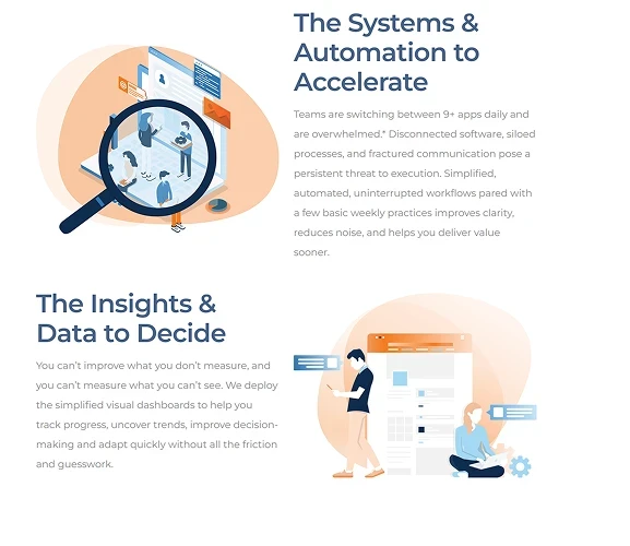
The old site was text-heavy and visually outdated, relying on an old corporate style and dated illustrations that no longer reflected the firm's level of expertise
1
/
8
Outdated look
The old site was text-heavy and visually outdated, relying on an old corporate style and dated illustrations that no longer reflected the firm's level of expertise
2
/
8
lack of hierarchy
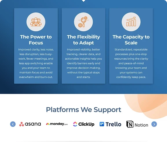
Competing colors and a lack of clear visual hierarchy made important information harder to identify, causing the page to feel even more overwhelming
2
/
8
lack of hierarchy
Competing colors and a lack of clear visual hierarchy made important information harder to identify, causing the page to feel even more overwhelming
Solutions
3
/
8
new color palette
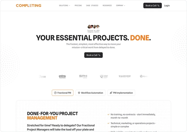
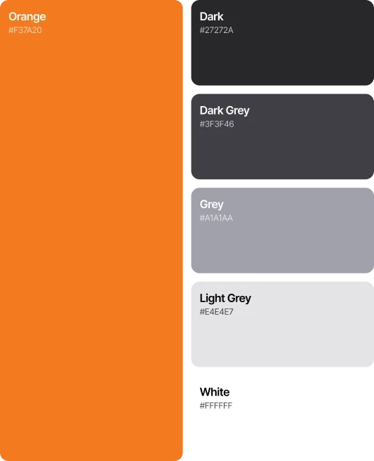
I started by stripping the visual noise. The previous site relied on competing colors and dated illustrations, so I reduced the palette to the brand's orange and grayscale to create a cleaner, more confident foundation
3
/
8
new color palette
I started by stripping the visual noise. The previous site relied on competing colors and dated illustrations, so I reduced the palette to the brand's orange and grayscale to create a cleaner, more confident foundation
4
/
8
typography selection
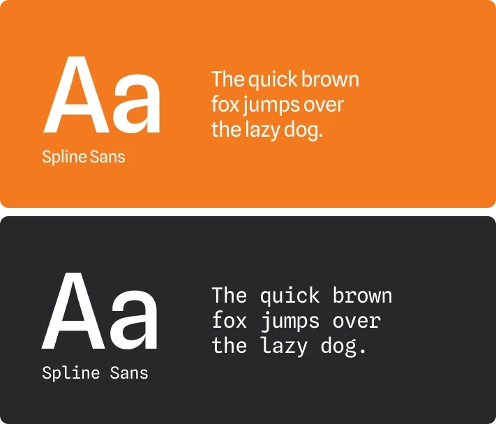
Then I made typography the new identity. I chose Spline Sans and its mono variation to give the site a modern character without making it feel overly trendy
4
/
8
typography selection
Then I made typography the new identity. I chose Spline Sans and its mono variation to give the site a modern character without making it feel overly trendy
5
/
8
button color
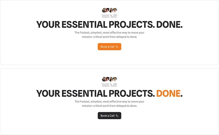
I kept the primary buttons dark instead of orange. Orange made the high-ticket consulting service feel too playful and startup-like, while dark buttons gave the page a more premium and established feel
5
/
8
button color
I kept the primary buttons dark instead of orange. Orange made the high-ticket consulting service feel too playful and startup-like, while dark buttons gave the page a more premium and established feel

6
/
8
all caps & color accent
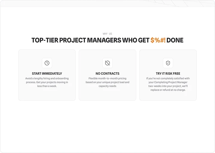
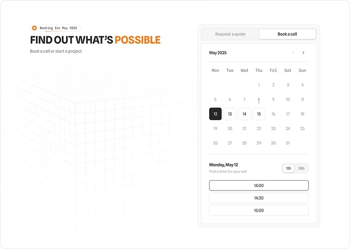
All-caps headings gave the page presence and authority. While the client's orange was deliberately kept subtle giving the page a recognizable brand accent without overwhelming the content
6
/
8
all caps & color accent
All-caps headings gave the page presence and authority. While the client's orange was deliberately kept subtle giving the page a recognizable brand accent without overwhelming the content
7
/
8
visual hierarchy
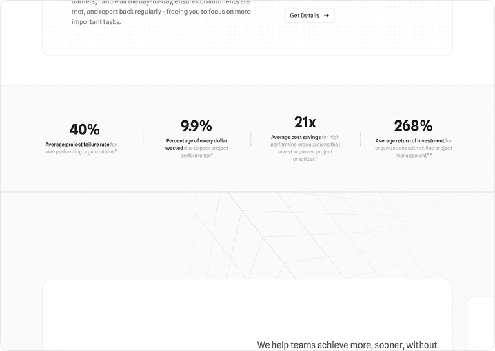
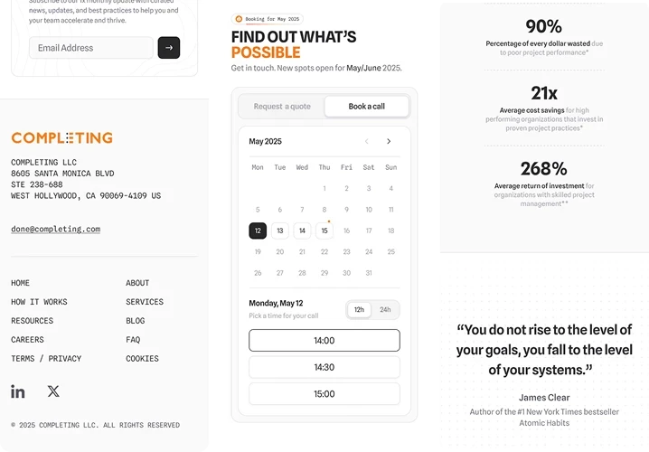
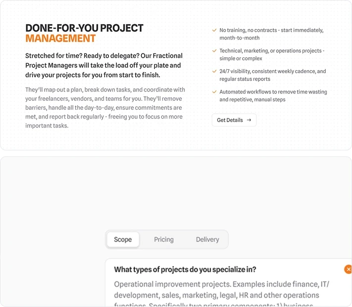
The bigger challenge was the amount of information. Instead of cutting content that users genuinely needed, I organized it using hierarchy, visual distinction, and progressive disclosure. This allowed the page to communicate more without making everything compete for attention
7
/
8
visual hierarchy
The bigger challenge was the amount of information. Instead of cutting content that users genuinely needed, I organized it using hierarchy, visual distinction, and progressive disclosure. This allowed the page to communicate more without making everything compete for attention
8
/
8
branded decoration
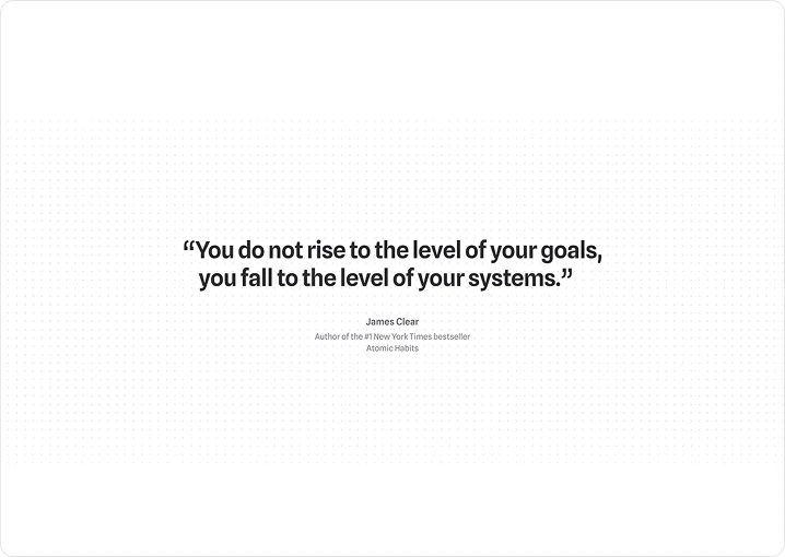
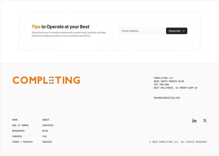
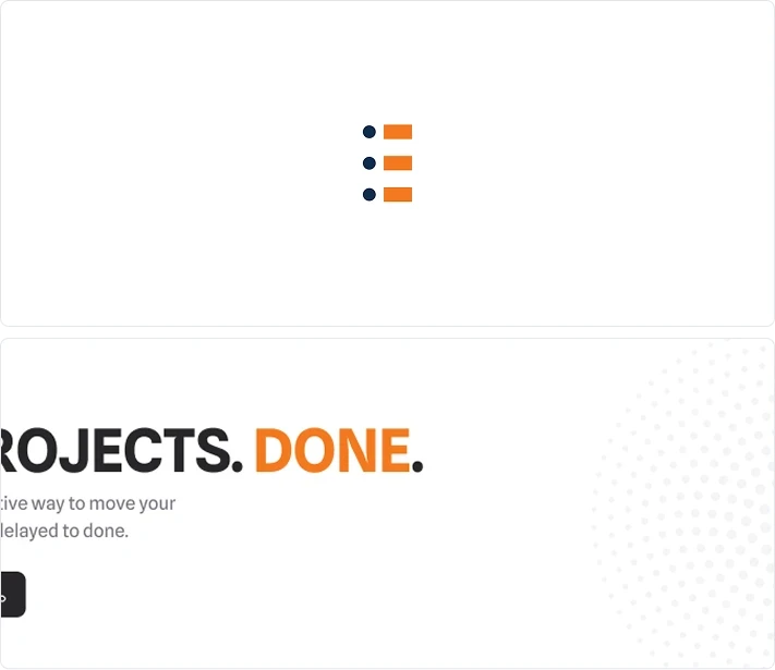
I needed a branded visual language without relying on generic imagery. The client's logo already featured a distinctive dot element, so I turned that into a subtle decorative system that reinforced the brand throughout the page without competing with the content
8
/
8
branded decoration
I needed a branded visual language without relying on generic imagery. The client's logo already featured a distinctive dot element, so I turned that into a subtle decorative system that reinforced the brand throughout the page without competing with the content
Results
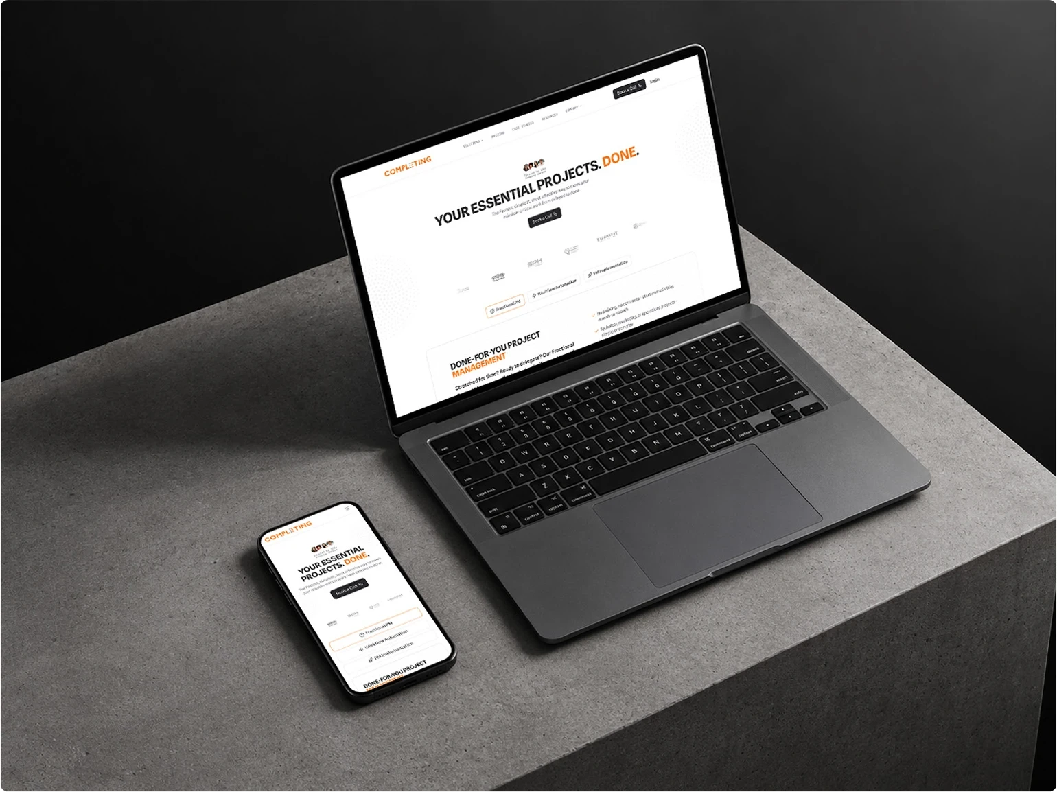
The redesign was approved without major revisions and expanded into a full website overhaul. The client was highly satisfied and continued working with me on the broader redesign
Results
The redesign was approved without major revisions and expanded into a full website overhaul. The client was highly satisfied and continued working with me on the broader redesign
You are so talented and creative and capture our brand so well. So glad to be connected, thankyou for the amazing work you do.
Operations Manager, Consulting firm
You are so talented and creative and capture our brand so well. So glad to be connected, thankyou for the amazing work you do.
Operations Manager, Consulting firm