E-Commerce UX Audit
Industry
Entertainment
Project Type
UX / CRO Audit
Tags
Heuristic Evaluation
Conversion Optimization
Friction Reduction
Role
UX Auditor
Timeline
1 - 2 Weeks
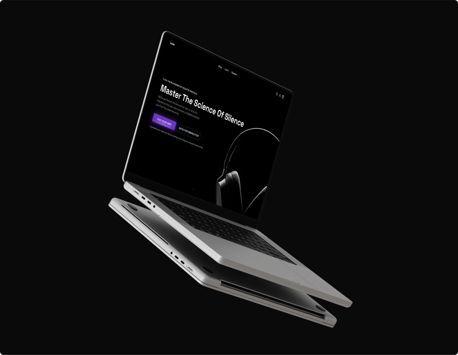
E-Commerce UX Audit
Industry
Entertainment
Role
UX Auditor
Project Type
UX / CRO Audit
Timeline
1 - 2 Weeks
Tags
Heuristic Evaluation
Conversion Optimization
Friction Reduction
Note
Due to an NDA, the client’s identity and product details have been anonymized, and the original products have been replaced with dummy products while keeping the business problem, UX strategy, and recommendations unchanged
Context
The client sells high-ticket entertainment equipment, with most traffic coming from private communities, meaning visitors already had purchase intent. However, an unoptimized UX made it harder to turn that intent into sales
Context
The client sells high-ticket entertainment equipment, with most traffic coming from private communities, meaning visitors already had purchase intent. However, an unoptimized UX made it harder to turn that intent into sales
Findings

1
/
11
Visual Hierarchy
Bright white text, long text blocks, and competing visual elements made the experience harder to scan and digest
1
/
11
Visual Hierarchy
Bright white text, long text blocks, and competing visual elements made the experience harder to scan and digest
2
/
11
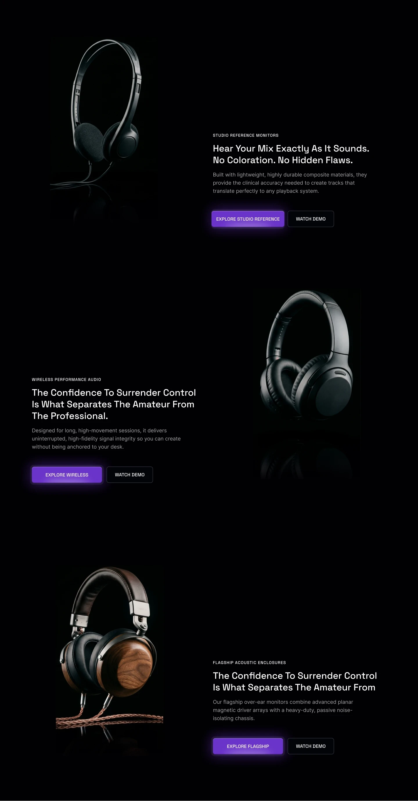
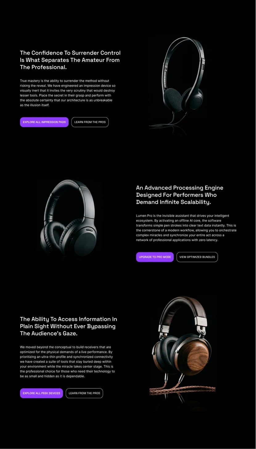
Uniform Product Layout
A repetitive product grid made the experience feel templated and caused products to blend together while scrolling
2
/
11
Uniform Product Layout
A repetitive product grid made the experience feel templated and caused products to blend together while scrolling
3
/
11
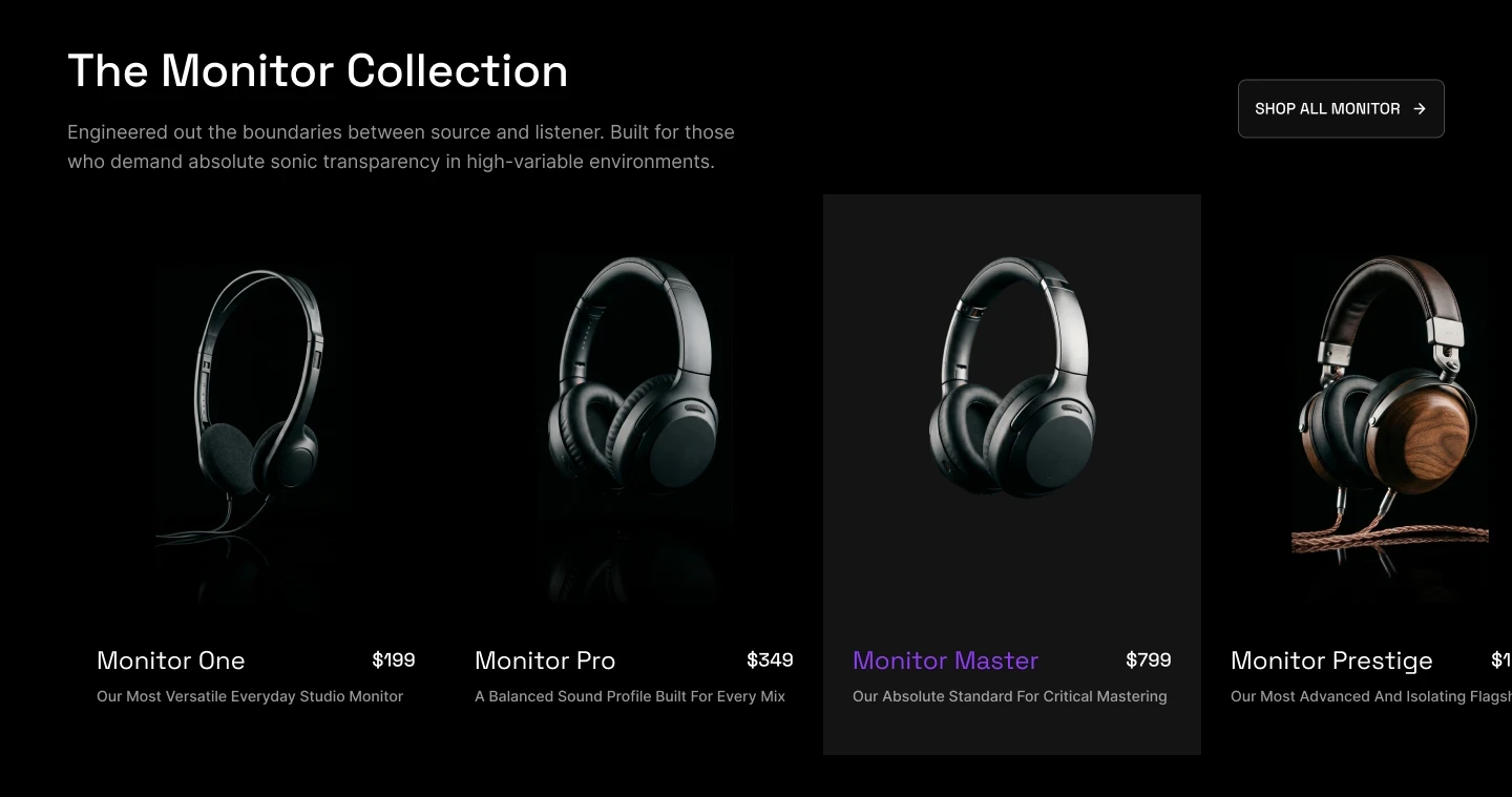
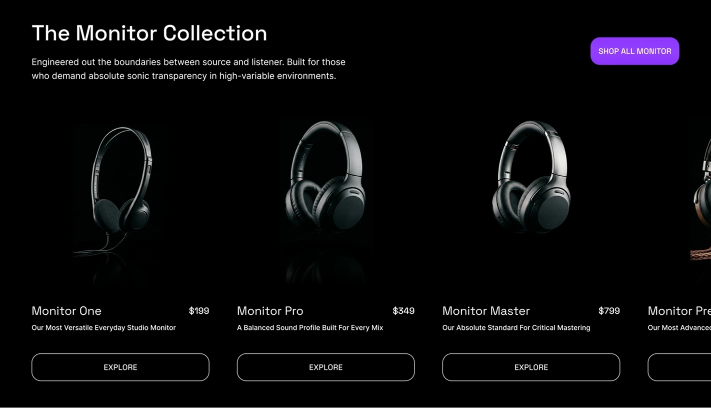
Redundant CTAs
Individual buttons on every product card added clutter while repeating the same action
3
/
11
Redundant CTAs
Individual buttons on every product card added clutter while repeating the same action
4
/
11
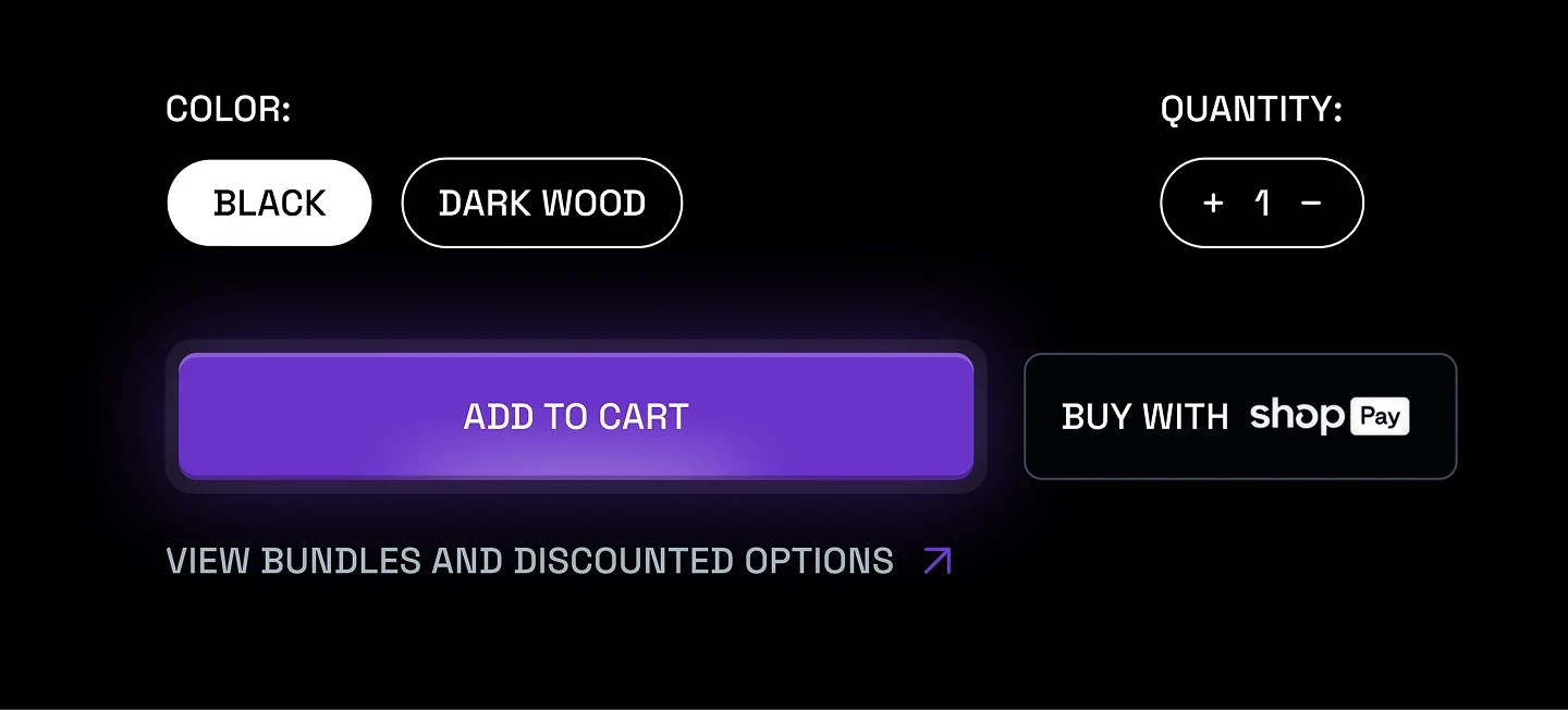
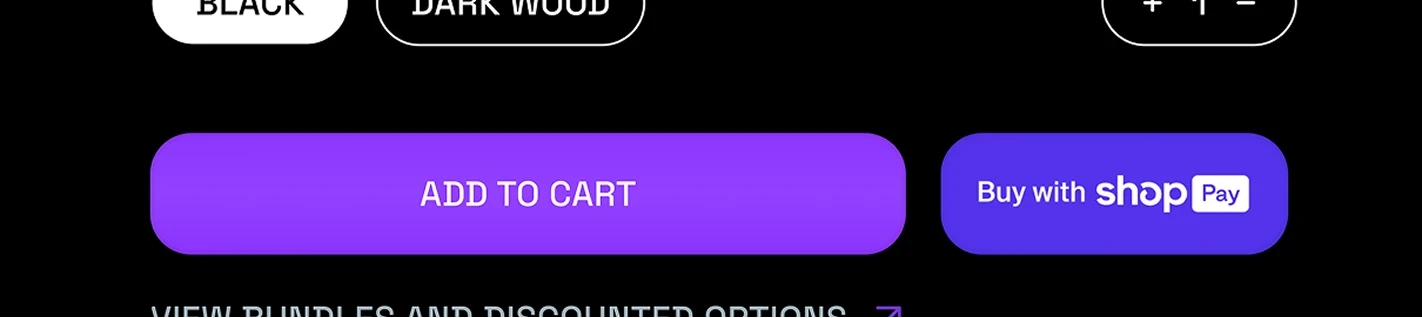
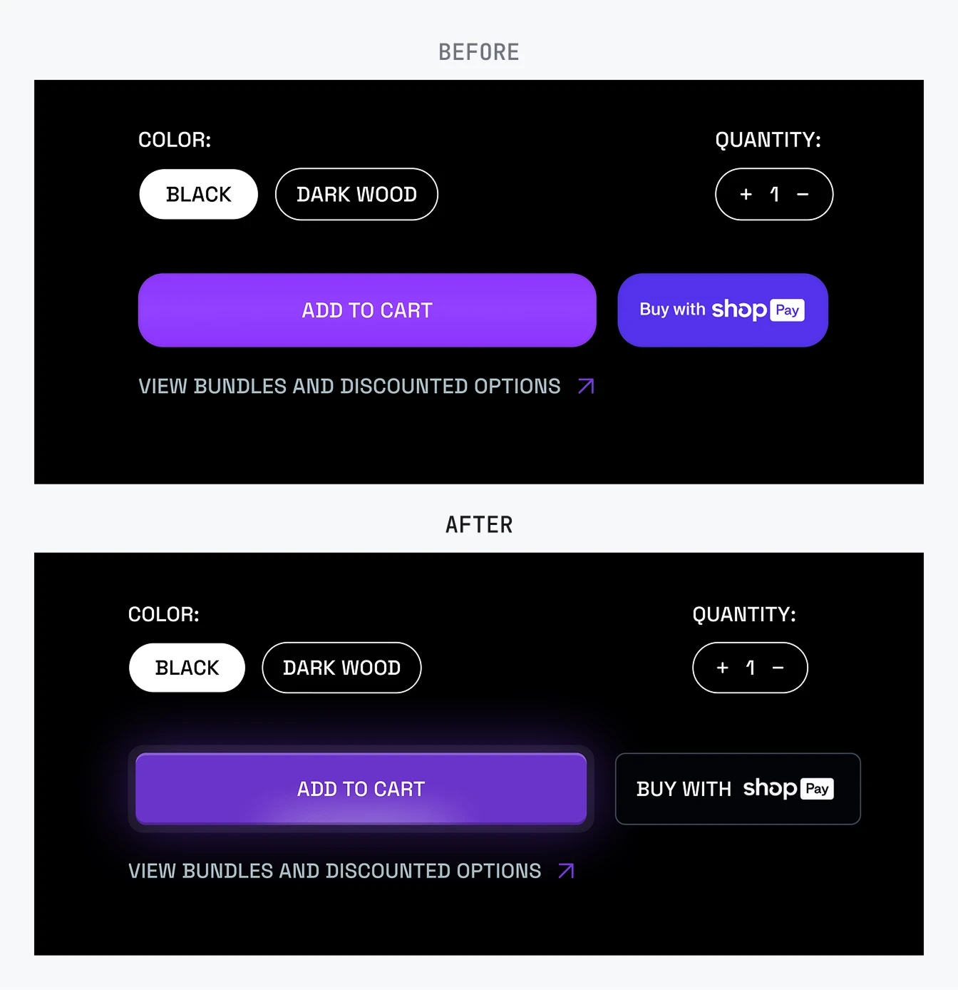
Competing Checkout Actions
Two equally prominent purchase actions forced users to make a decision at the most critical point in the funnel
4
/
11
Competing Checkout Actions
Two equally prominent purchase actions forced users to make a decision at the most critical point in the funnel

5
/
11
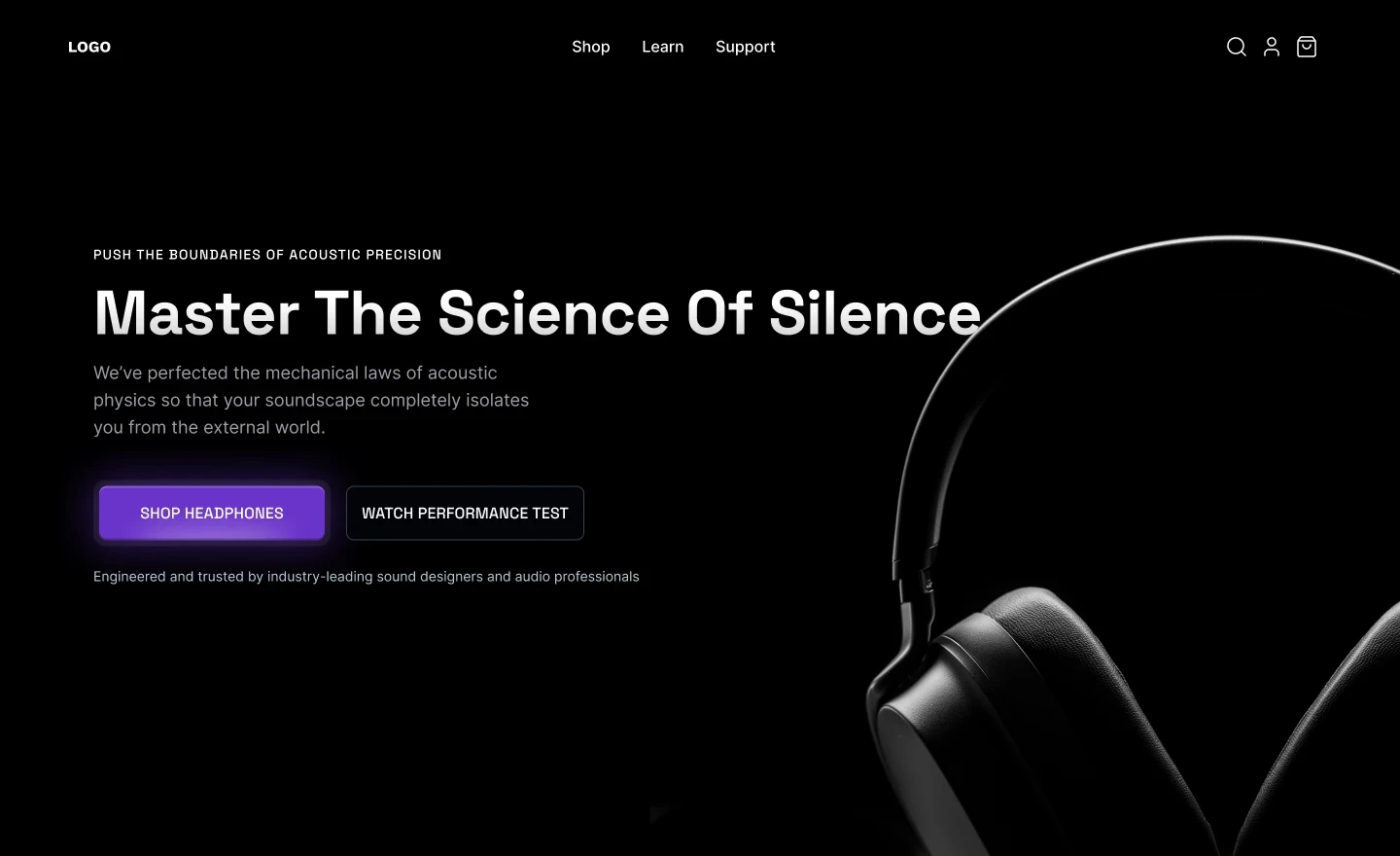
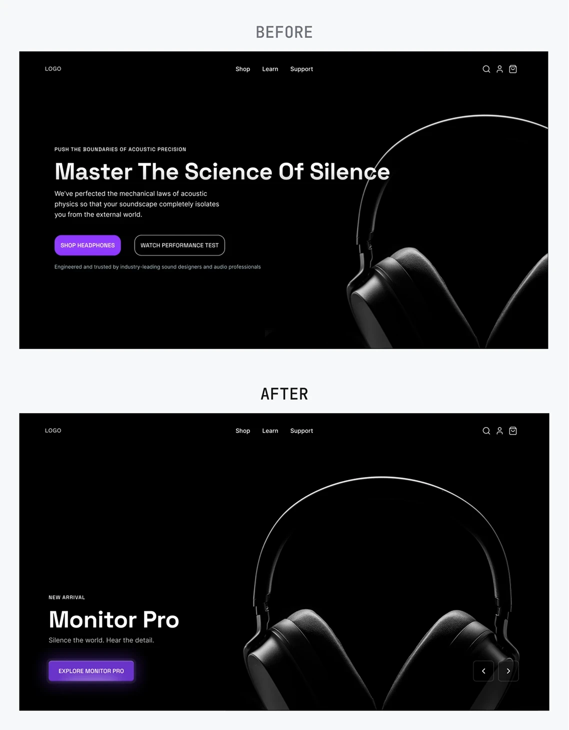
High-Intent Friction
The hero section treated visitors like cold traffic, making them go through marketing content before they could start browsing products
5
/
11
High-Intent Friction
The hero section treated visitors like cold traffic, making them go through marketing content before they could start browsing products
Recommendations
6
/
11
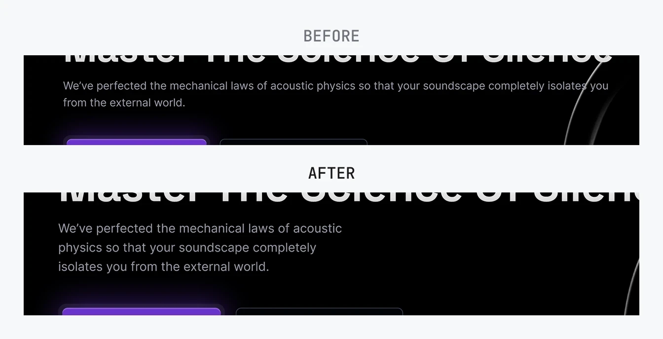
Readable Typography
Reduced body text contrast and constrained text width to create clearer hierarchy and more comfortable reading
6
/
11
Readable Typography
Reduced body text contrast and constrained text width to create clearer hierarchy and more comfortable reading
7
/
11
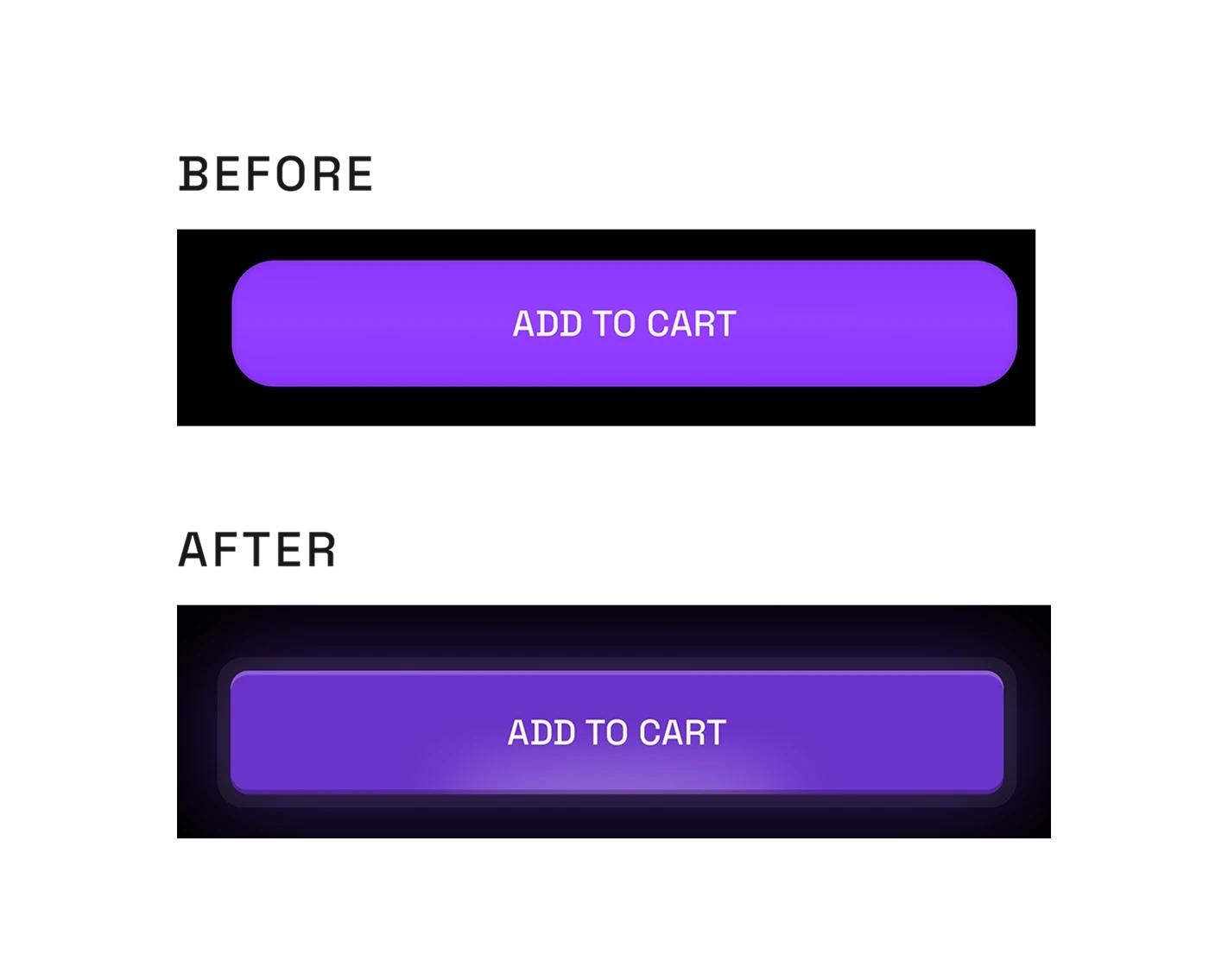
Distinctive CTA Design
I gave the buttons a more stylized treatment to reflect the premium products and strengthen the brand’s visual identity. Rather than copying ultra-minimal styles from established brands, the niche product allowed for more creative visual expression
7
/
11
Distinctive CTA Design
I gave the buttons a more stylized treatment to reflect the premium products and strengthen the brand’s visual identity. Rather than copying ultra-minimal styles from established brands, the niche product allowed for more creative visual expression
8
/
11
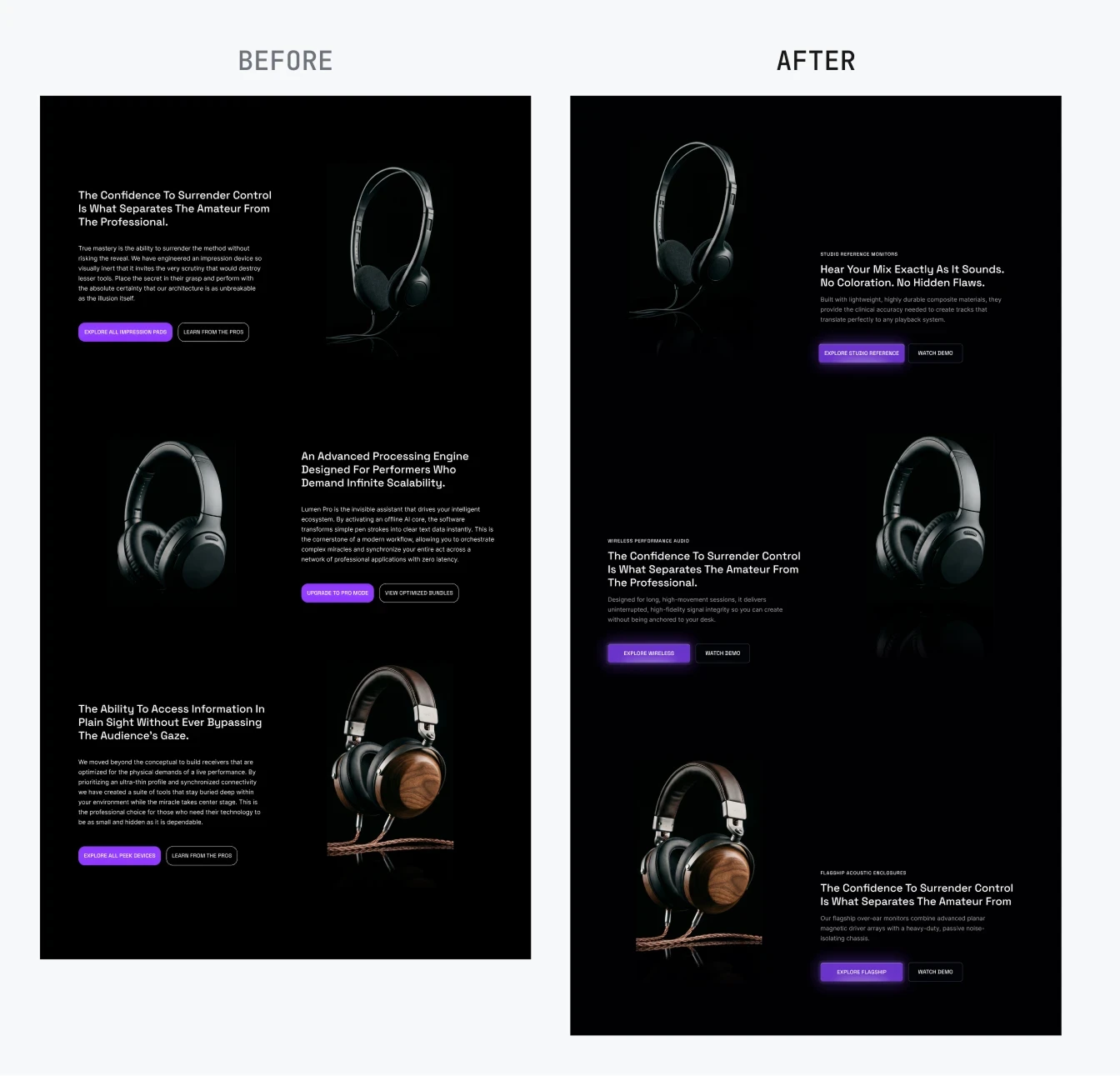
Visual Pattern Breaks
Reduced copy length and Introduced asymmetry into product showcases to break repetition and give the catalog more visual rhythm
8
/
11
Visual Pattern Breaks
Reduced copy length and Introduced asymmetry into product showcases to break repetition and give the catalog more visual rhythm
9
/
11
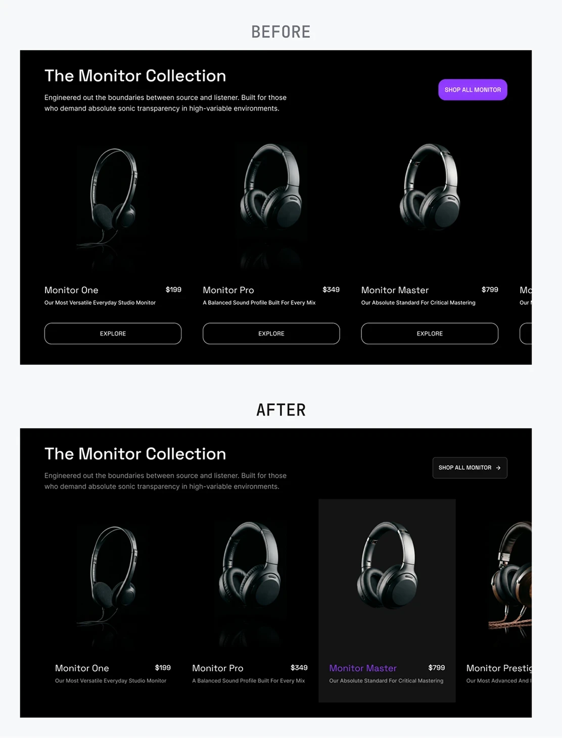
Larger Touch Targets
Turned entire product cards into interactive targets, removing redundant buttons while making mobile interactions easier
9
/
11
Larger Touch Targets
Turned entire product cards into interactive targets, removing redundant buttons while making mobile interactions easier
10
/
11
CTA Prioritization
Established one dominant purchase action and visually demoted the secondary option to reduce hesitation at checkout
10
/
11
CTA Prioritization
Established one dominant purchase action and visually demoted the secondary option to reduce hesitation at checkout
11
/
11
Product-First Hero
Rebuilt the hero around product discovery, putting categories directly in the first fold so high-intent visitors could start shopping immediately
11
/
11
Product-First Hero
Rebuilt the hero around product discovery, putting categories directly in the first fold so high-intent visitors could start shopping immediately
Context
The client accepted all recommendations, hired me to implement them, and continued returning for additional audits and a new landing page, eventually trusting me to design new experiences without another audit
Context
The client accepted all recommendations, hired me to implement them, and continued returning for additional audits and a new landing page, eventually trusting me to design new experiences without another audit
Working with Syahrul was a great experience. He has a strong attention to detail and went above and beyond to deliver quality assistance. I would recommend his services to anyone seeking a UX/UI designer.
Founder, Design Agency
Working with Syahrul was a great experience. He has a strong attention to detail and went above and beyond to deliver quality assistance. I would recommend his services to anyone seeking a UX/UI designer.
Founder, Design Agency